
Auto Layout Tutorial for Beginners with Xcode 9 and iOS 11


What is Auto Layout?
Auto Layout is a tool from Apple that enables you to create user interfaces that adapt to the different screen sizes of iPhone and iPad devices (and Mac too!). It's like responsive web design, but it provides more control (and dynamic behaviors).
You use Auto Layout to provide your iPhone app with rules about the position of labels, images, scroll views, and content that makes up the user interface in your app. In addition to position you'll provide rules about size.
Some sizes can be implicitly determined, for example if you've set a font size and you have text. The iPhone can figure out how wide and tall your label will be. Images also provide implicit height information, that the iPhone will use.
Many times you will also need to provide explicit height and width information to finely control how big an image (i.e.: profile image) appears on the screen.
Why Auto Layout?
Much like giving a friend directions for how to get to your house, you need to be explicit and describe in detail where things will appear on the screen.
If you fail to give specific rules, your friend will not be able to find your house and will be lost.
The same thing happens with iPhone apps. If a view (image or label) doesn't have enough information about where it needs to be on the screen, it won't appear where you expect it to appear. It might be off-screen (not visible), it might be squished, or it might be at the top or bottom of your app's screen.
Some content also has an intrinsic content size. This size is the minimum size that the UI element will be. An on/off switch has a fixed instrinsic content size. They are always the same size on your iPhone screen and you cannot make them bigger or smaller (plus that would violate Apple's Human Interface Guidelines).
Deconstructing Auto Layout on the App Store
Before you dive into learning how to specify the rules, look at an iPhone app screenshot from Instragram.
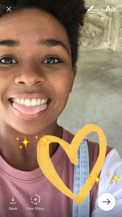
This is the image editor for Story photos in Instagram. It allows you to mark up a picture with a marker, stickers, and text. You have options to save the photo locally, add it to your public story (resets every day), or share it with a small group of friends.
There are a number of buttons positioned around the screen on top of a full-bleed image that has been marked up.
- The X (close) button is pinned to the top left corner.
- The Aa text button is pinned to the top right corner.
- The Marker button is pinned to the top edge and it's right edge is pinned to the Aa button's left edge.
- Each of these buttons is inset from the edges of the screen, or adjacent buttons, by 20 points.
- The Save button is pinned to the bottom left corner.
- The Your Story button's bottom edge is pinned to the bottom of the screen, and the Your Story's left edge is pinned to the right edge of the Save button.
- Both the Save and "Your Story" buttons have a label that is pinned to the bottom, and centered along the x-axis with the button graphic.
- The "Continue" arrow button is pinned to the right corner.
- The "Continue" arrow button has a background circle graphic that is 60x60 points.
- The entire background view has the camera image pinned to all sides, and it is set to aspect fill so there are no black bars.
- On top of the background image view are user created drawings or stickers that are pinned in place above the image. These graphics are all positioned in screen space relative to the image.
- Every button icon is 40x40 points.
- All of the graphics here have been rendered for 1x, 2x, and 3x retina resolution to support the retina screens on various iPhone sizes.
Create a Sketch
Taking this information, make a sketch (on paper) of the Instagram photo editor UI to draw the positions and sizes of each of the elements.
All of these rules are rules that we can describe in English to explain the position and size of the UI elements.
Now draw a bigger wider/taller rectangle.
How should the buttons behave on a new screen?
Draw a second sketch with the icons in the new locations on a bigger screen.
You can practice this skill with a few different apps on your iPhone or the App Store.
Try and figure out how the UI should adapt to a new screen size.
Follow Along with Auto Layout
In this lesson I'll show you how to use the vector graphics (download below) to design the user interface. Afterwards I'll take you step by step on creating the Auto Layout constraints.
Download the Xcode Project Files
Follow along and create the Instagram Photo Editor UI from scratch using the design files (vector and image files). You can also look at the finished project if you get stuck.
What's Next?
Over the next month I will be releasing new content on Auto Layout. I have an upcoming Auto Layout course that will allow you to learn Auto Layout fast! More details soon.