30 Auto Layout Best Practices

To design iPhone or iPad app user interface that resizes for any device you need Auto Layout. Auto Layout enables responsive design between different sizes of iPhones and iPads. In this guide you'll learn 30 Auto Layout Best Practices that you can apply to your own iOS apps.
SwiftUI will replace Auto Layout in the future, but if you're still shipping existing apps, you need to understand Auto Layout until SwiftUI is production ready and at feature partity. WWDC 2020 made strides, but SwiftUI is still not enough.
Auto Layout is a series of rules that describe the position and size of your images, buttons, and labels in your iPhone app. It allows you to dictate where different images, buttons, labels, and content panels will appear and resize.
Rigid pixel-perfect designs are out. Responsive pixel-perfect designs are in.
To create captivating mobile experiences your UI designs must scale up and down between the iPhone SE, iPhone 8, iPhone 8 Plus, iPhone X, and iPad.
Download the Auto Layout Best Practices
Beginner Friendly
If you're a beginner and you've struggled with ambiguous layouts, misplaced views, disappearing views, or conflicts then you're in the right spot. Even as an experienced programmer, you may find yourself mystified at why Auto Layout doesn't work like you expect.
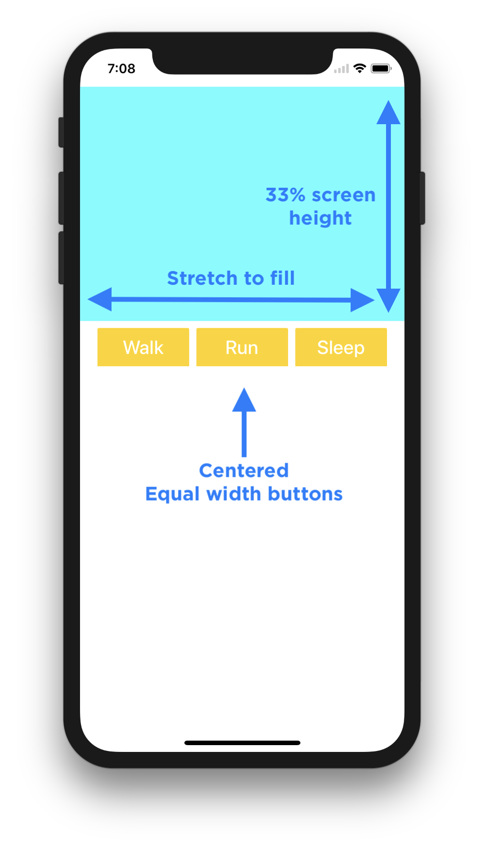
Auto Layout allows you to define regions to fill a percentage of your iPhone X screen size, to center horizontally, or to maintain equal widths.
Feel free to jump around between the different best practices using the table of contents, or the PDF version of the Auto Layout Best Practices.
Please let me know what tip is the most helpful. Write a comment below, or send me an email: mailto:Paul@SuperEasyApps.com.
If you have any tips, please share them. I can't wait to see what you create!
30 Auto Layout Best Practices
The 30 Auto Layout Best Practices will give you a head start on working through quirks in Xcode 9 and strategies that will allow you to work faster and more efficiently.
Download the guide and you can save yourself from countless hours, days, and even weeks of frustration.
- Design for iPhone 8
- Layout Your UI for One iPhone
- Undo and Redo
- Relative and Centered Layouts
- Identify Structural Regions
- Understand the Colors
- Work in One Direction
- The Light at the End of the Tunnel
- The Hidden Layout Error Panel
- Change Background Colors
- The Diagonal Drag
- The Shift Key Modifier
- Adding Difficult Constraints
- Fix the UIImageView Content Mode
- When to Use Stack Views
- Design Resizable and Scalable Images
- Stretch Correctly with Image Slicing
- Create Custom @IBDesignable UIViews
- Advanced Image Resizing
- Resizable UIImages using Swift 4 Code
- Advanced Constraints Editor
- Test Different iPhone Size Classes
- Fix Constraint Conflicts
- The One View
- Frames vs. Constraint Constants
- Iterate Quickly with Copies
- Backup Auto Layout
- Clear Constraints and Restart
- Alignment and Tie Fighter Buttons
- Don't Use These Settings
1. Design for iPhone 8
Keep it simple.
Design your UI for a single iPhone screen first.
Auto Layout is a relative and absolute placement tool to create perfect layouts for any iPhone or iPad.
Auto Layout gives you control of:
- Position
- Size
- Stretching and compression
- Percentage-based layouts
- Relative layouts
- Fixed layouts
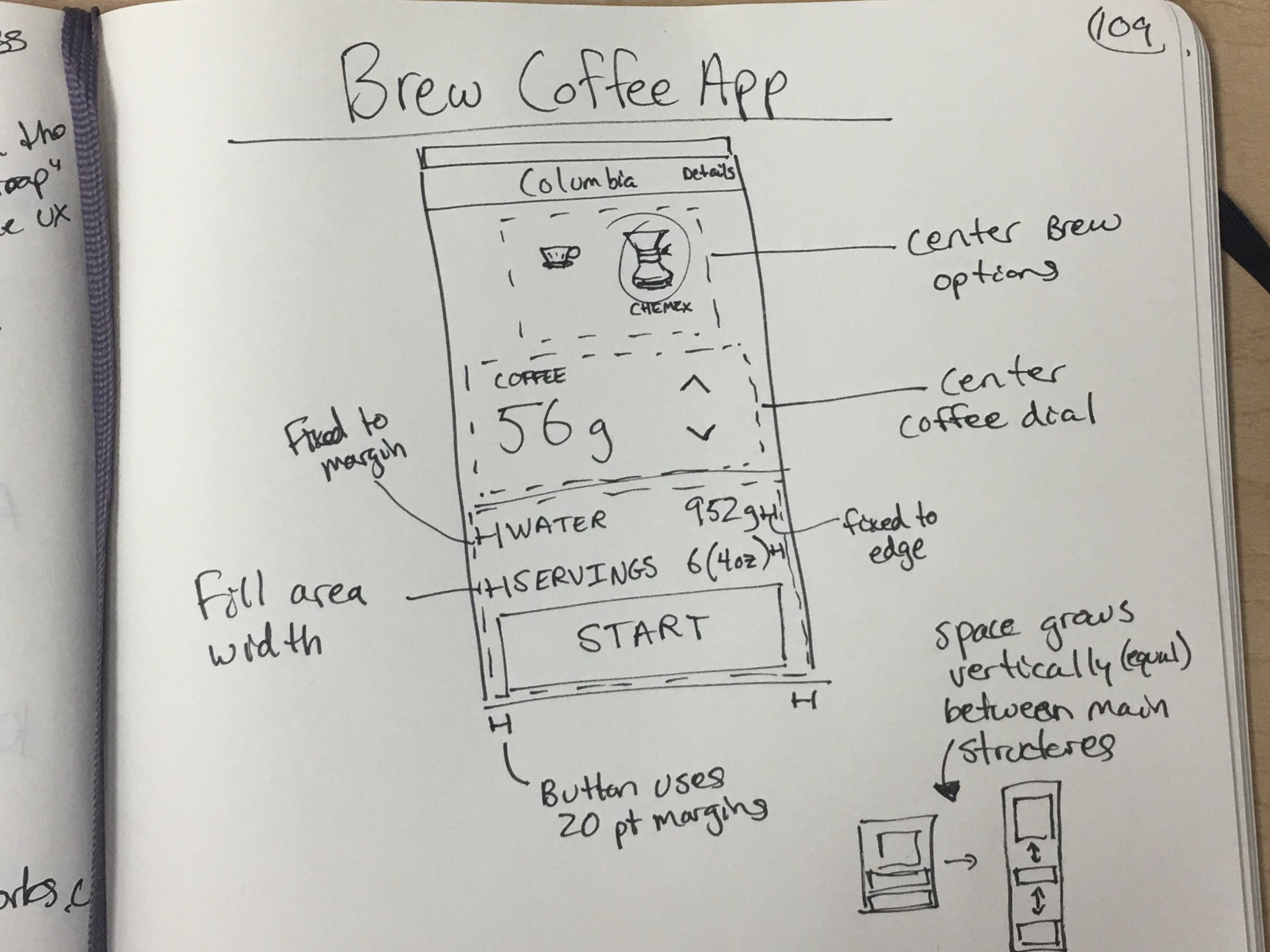
If you watch an artist paint. They don't start painting, instead they start by sketching the forms to prepare the painting.
You'll need to do the same thing with your iPhone design. Start with a sketch and plan for one iPhone screen. Next you can start to think about how the design would adapt to new screen sizes.
You might ask yourself:
- Should the title label stretch from edge to edge?
- Should the background photo use a 70% width fill?
- Should the font sizes change for the iPad?
- Should the vertical text heights change in landscape mode?
- Should the buttons be centered in the lower half?
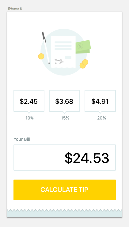
To keep it simple, in Sketch or Illustrator, create a mockup for the iPhone 8 size (W x H: 375 x 667 points).
I use Sketch for everything. Exporting images (.png) and vectors (.pdf) is quick and easy (compared to the clunky Illustrator interface).
In Sketch you can quickly export @1x, @2x, and @3x images for the different retina resolutions that you can drag-and-drop into Xcode.
Workflow: Start Your UI Design
- Create a rough sketch on paper (I use black 0.3mm Staedler pigment liners and large Moleskin notebooks)
- Design a wireframe in Sketch
- Design or download button icons for the iPhone 8
- Export the vector or image assets at 1x, 2x, and 3x sizes for (.png) or 1x for vector (.pdf)
- Add the graphics to Xcode's Asset Catalog
After you have finalized how you'd like the app to look, the next step is to design the UI in Xcode's Storyboard files.
2. Layout Your UI for One iPhone
Translating a design file into an Xcode Storyboard can take some problem solving skills. To keep it simple, start with the iPhone 8 size.
One of the biggest mistakes beginners make is switching between iPhone screen sizes to "check" the layout, only to break things.
Save yourself the time and frustration by designing your app UI for iPhone 8 (no one likes to redo work).
Here is a Sketch design that has been implemented in Xcode's Storyboard.
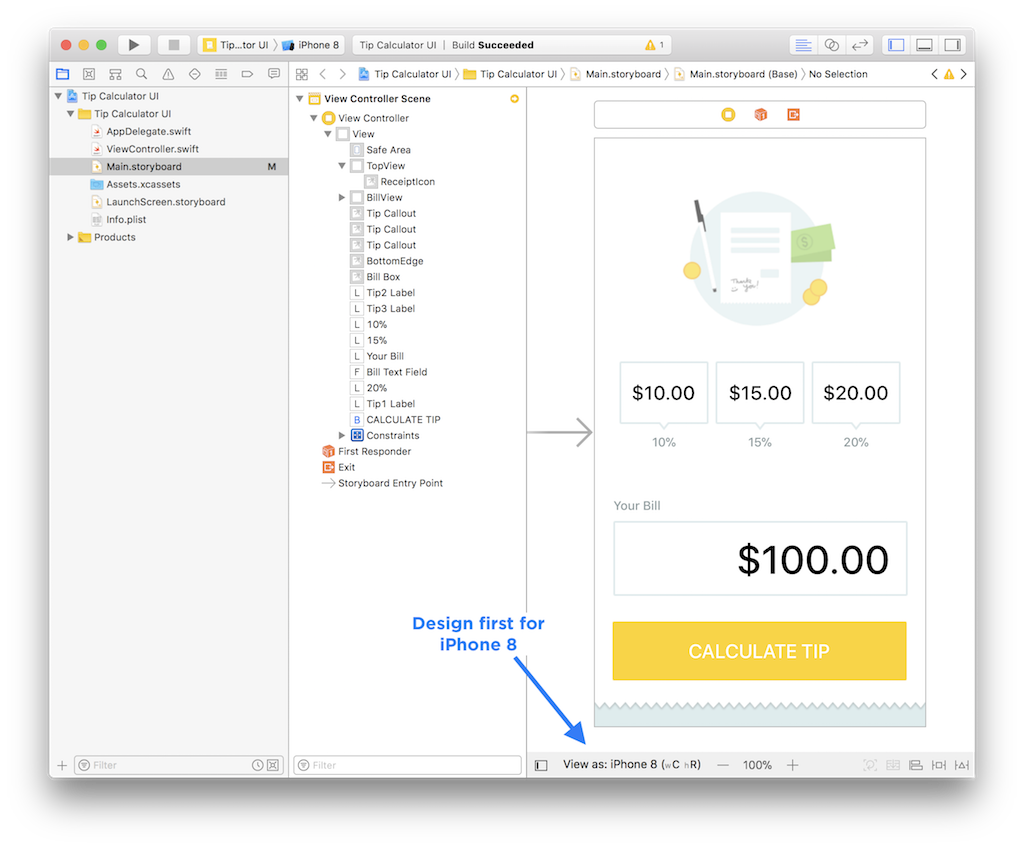
If you want to learn how to design your first iPhone app, checkout my free 4-part email course (iPhone Apps 101).
Your goal is to translate all of the fonts, images, and content from your design mockup into Xcode's Storyboard canvas (watch Lesson 2 from iPhone Apps 101 for details).
iPhone Simulator
On your Mac you can simulator any kind of iOS device, Apple TV, and even Apple Watch. You don't need to own a device to make an iPhone app.
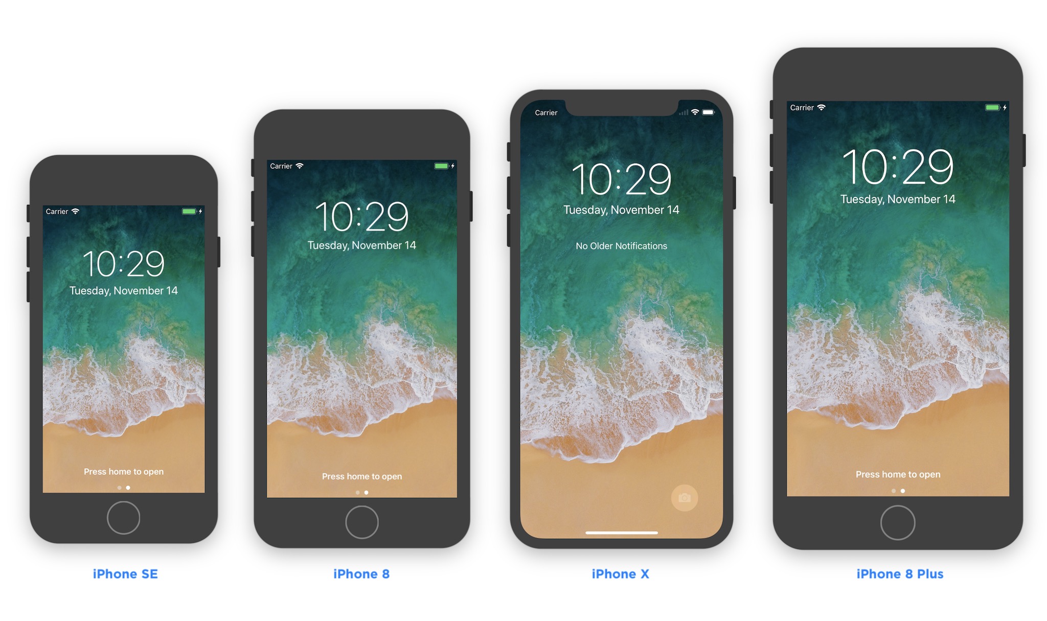
It's faster to test with a simulator instead of a real device, and smaller iPhone screens will run faster on slower Mac computers.
When you open an Xcode project, the default simulator is an iPhone 8 Plus (it's HUGE!). You should always change this to the iPhone 8 Simulator, or you'll end up waiting longer for apps to start.
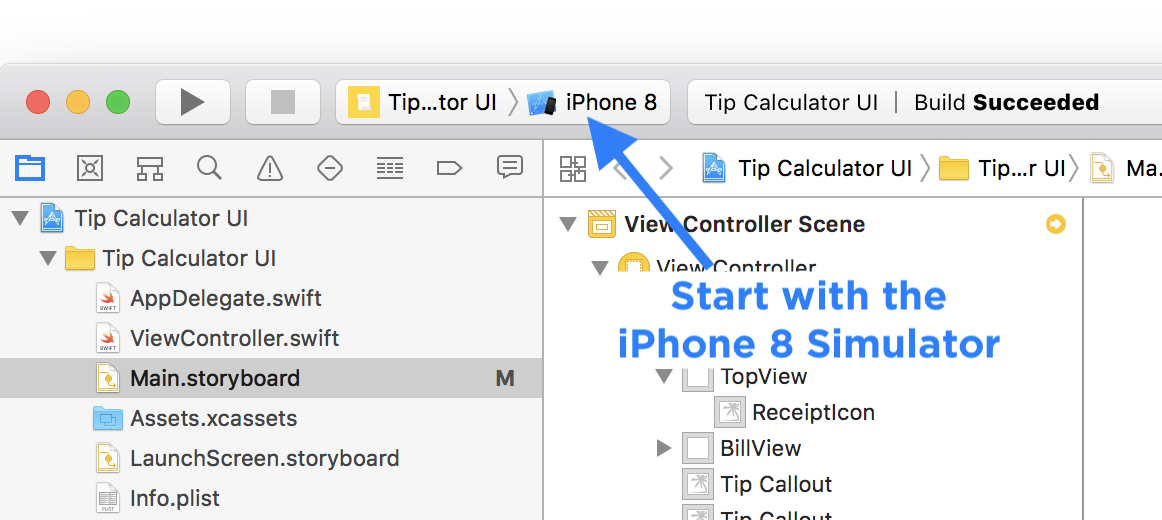
You can test on the different screen sizes after you set your Auto Layout constraints.
If you want to run your app on your iPhone using your Apple ID (or using WIFI debugging), watch Lesson 1 from iPhone Apps 101.
Preview
Xcode has a built in Preview panel that will help you test Auto Layout constraints faster using any iPhone or iPad device.
You can test landscape and portrait layouts as you make changes, which will save the hassle of waiting for your app to launch every time you make a change.
Workflow: Use Xcode Layout Preview
- Open your Storyboard file
- Show the Assistant Editor
- Choose the Preview in the Jump Bar
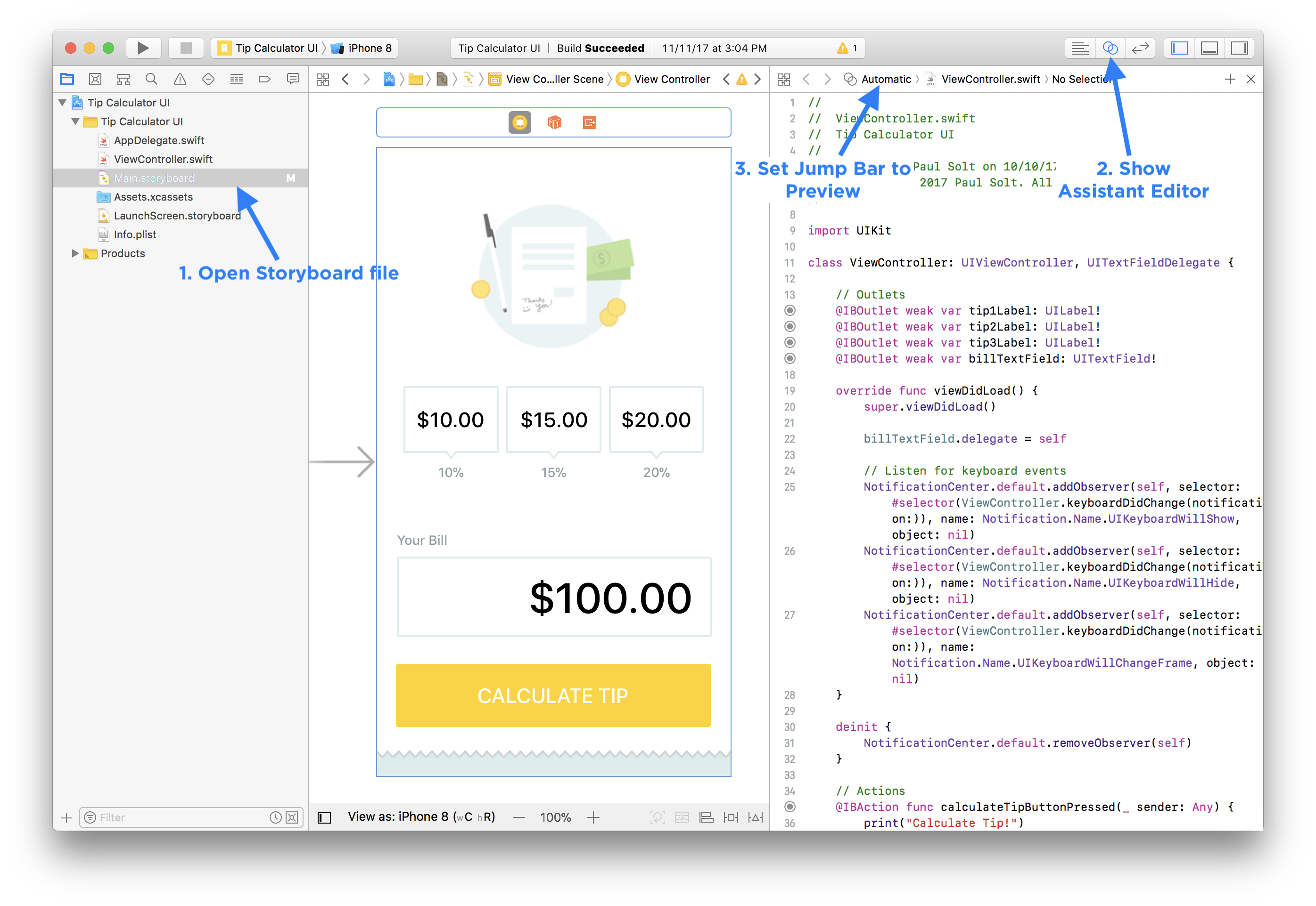
Storyboard Preview Overview
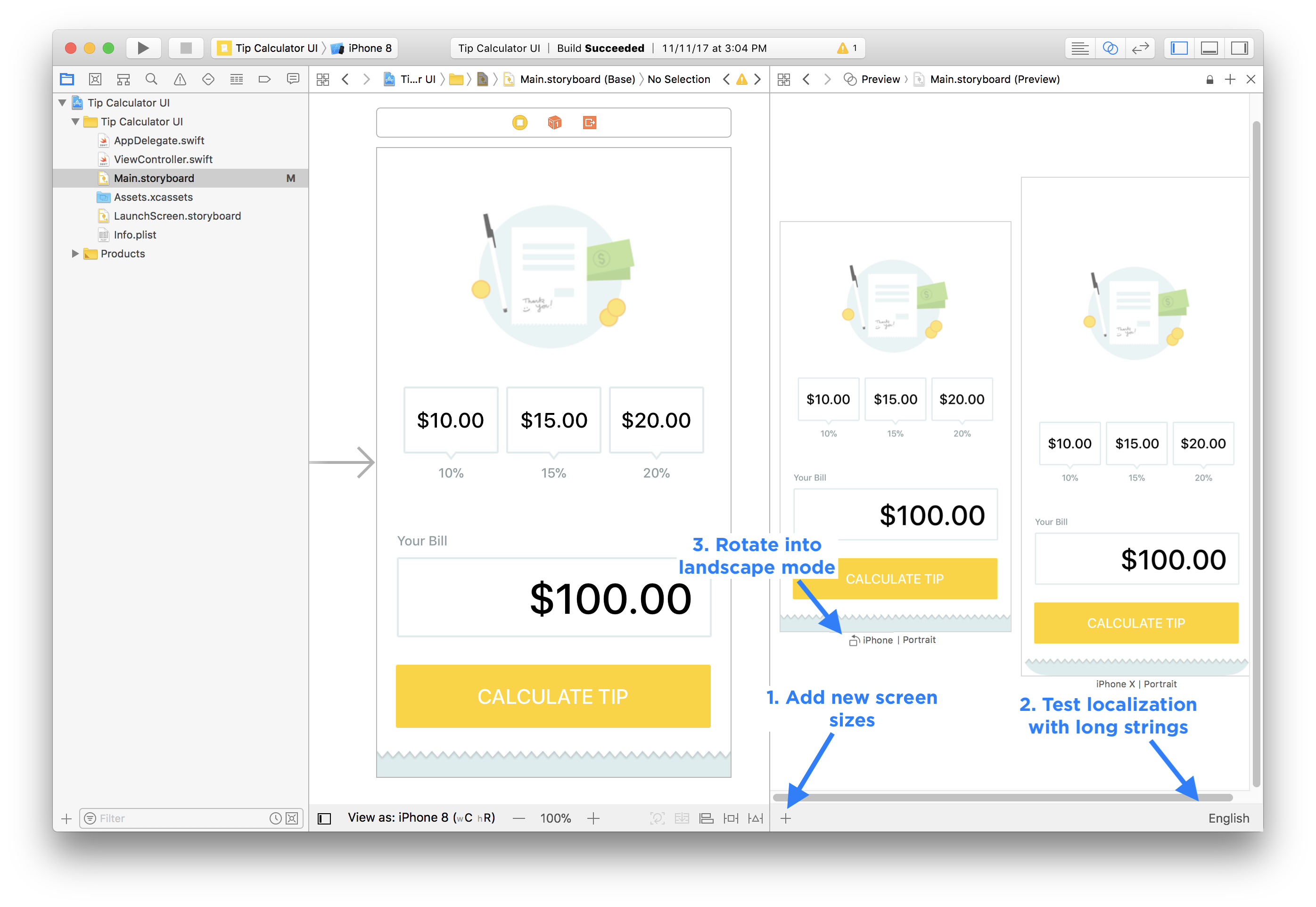
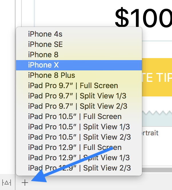
Add New Preview Screens
You can test out every combination of screen sizes when you add new screens, or rotate existing. Using preview will be significantly faster than launching each device and manually checking layout changes.
Keep in mind, that the preview screen will help you fix problems quickly, but you should test your app on a real device before you submit to the App Store.
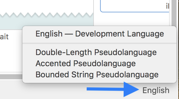
Test Localization
To make sure your layout works in other languages, the "Double-Length Pseudolanguage" will help you determine if you have to fix any layout issues. Languages like German take up almost twice the length of words in English.
3. Undo and Redo
You should never be afraid to make changes. If a button, view, or label moves and you don't like the change: undo and try again.
Use the keyboard shortcuts:
- Undo: Command + Z
- Redo: Command + Shift + Z
You might even add the wrong constraint and see a lot of red. That's a good time to undo and try again.
Sometimes I feel dyslexic reading all of the options, and I'll accidentally add the wrong constraint. When this happens I just use undo to get back to a previous step, and then I try again.
Tip: For more complex views, like the Stack View, you may have to undo multiple times, instead of just once.
4. Relative and Centered Layouts
Layouts are relative, and to get into that mindset, try and slice up the main content regions of your app.
Here's a photo of my dog Row centered in the top third, and three buttons centered along the bottom edge of the photo.
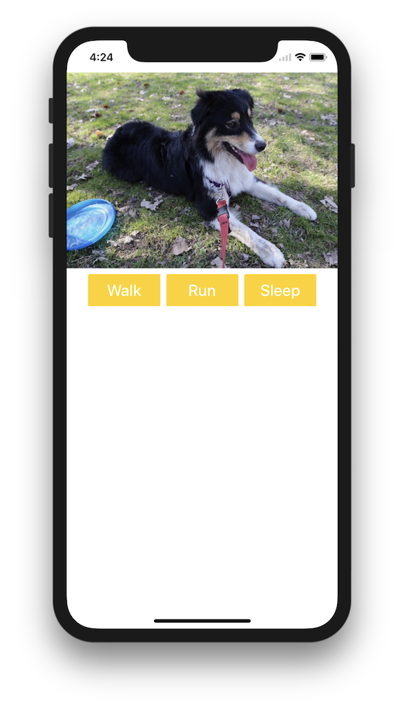
Tip: The default spacing between most iOS UI elements is 8 points, and 20 points on the edges.
To center content and get more control, you need to add additional subviews (even if these UIView's are transparent or white).
Workflow: Center Content
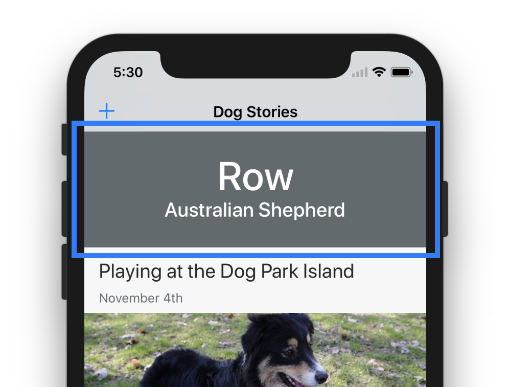
Your goal is to center a title and subhead using two UILabel's in the top of an iPhone app and have them centered both vertically and horizontally.
-
Add a new
UIViewto the top (colored green to help layout).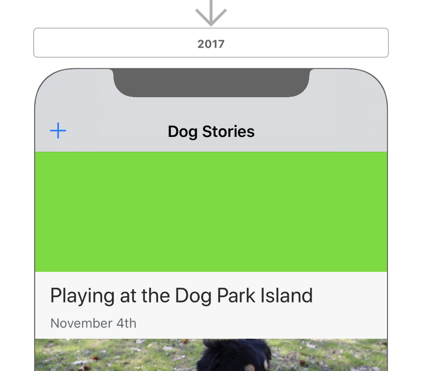
-
Rename the top view "TopView" (or something descriptive) and add the subviews into it.

-
Add constraints to pin the "TopView" to the edges.
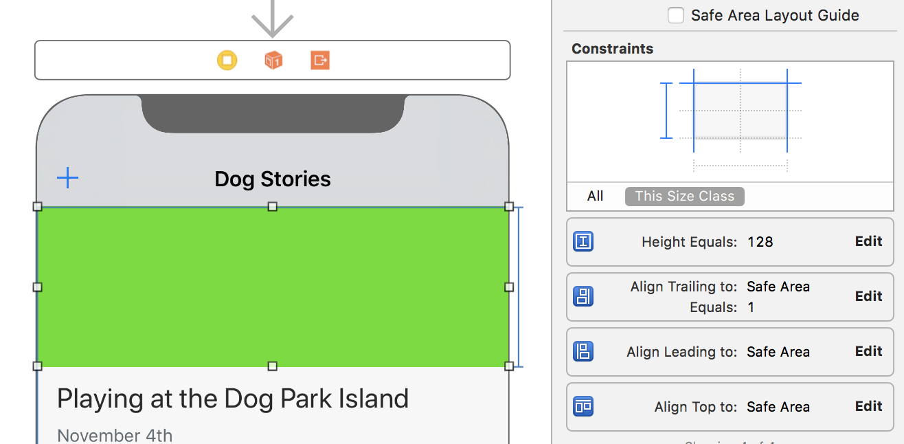
-
Embed both
UILabel's inside and position them in the center.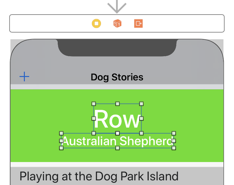
-
Add constraints to center your content inside of the top view.
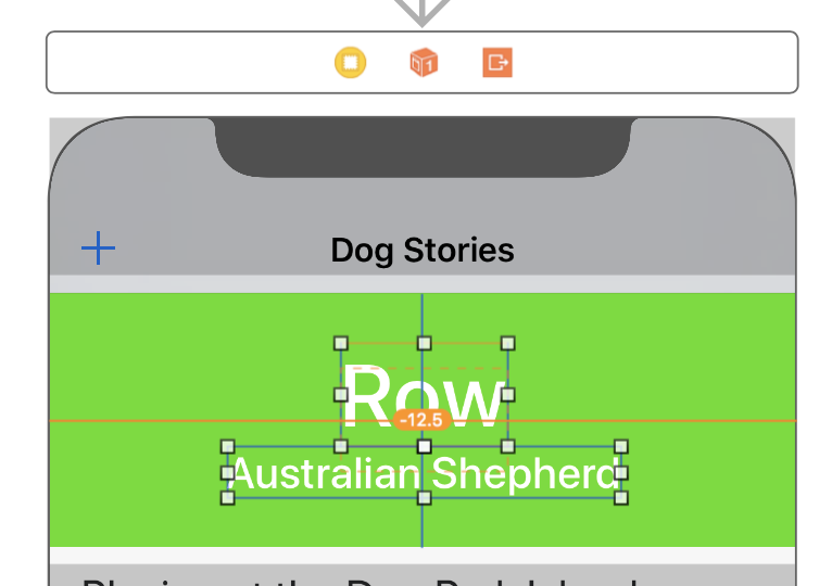
-
Update the Constraint Constants to use the current canvas position.
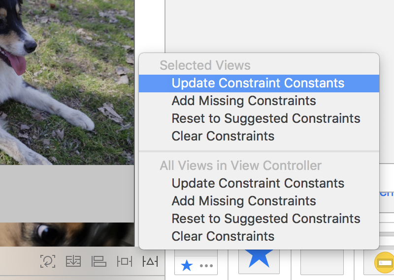
-
The final layout without the green color should look centered.
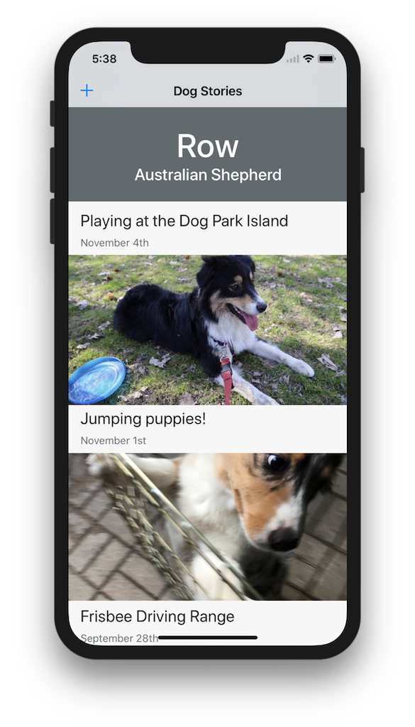
5. Identify Structural Regions
Auto Layout constraints are most important when you focus on the areas that will impact the overall structure of an iPhone screen.
Identify the big UI elements that lead to the overall structure by thinking about what areas fill the space.
Ornamental or supplemental accessory title UILabel's or UIImageView's are positioned relative to the main structure portions of your app.
Workflow: Sketch your UI on paper.
- Markup what regions are important to the overall structure.
- Which regions should stretch?
- Which regions should remain fixed (height and width)?
- Which elements are supplemental? (i.e.: relative to the position or edge of the major structures)
- Translate these concepts into your layout constraints
6. Understand the Colors
Auto Layout constraints will not appear to be correct unless they are blue. When you first start adding constraints you are going to see a lot of colors.
- Blue: Layout Complete
- Orange: Layout Warning
- Red: Layout Error
Blue: Layout Complete
If you add all the layout constraints in both the vertical and horizontal directions you will see blue lines and I-beams.
When your layout looks blue, that means you have enough layout constraints and that you're finished.
Orange: Layout Warning
Misplaced Views
You might accidentally bump a view, and when that happens after you've already setup the layout constraints is that you'll see orange lines.
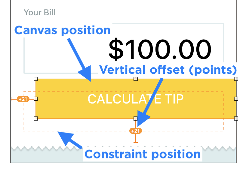
- The dashed orange line shows the position the view will be on your iPhone.
- The current position on the canvas doesn't match the layout rule.
Fix it:
- "Update Frames" will snap the view back to it's original position.
- Or "Update Constraint Constant" will use the new position and update your Auto Layout constraints.
Localization Issues
New in Xcode 9 are additional warnings about trailing or leading constraints for text labels. These new warnings appear to help developers fix issues with right-to-left language support on iOS 11.
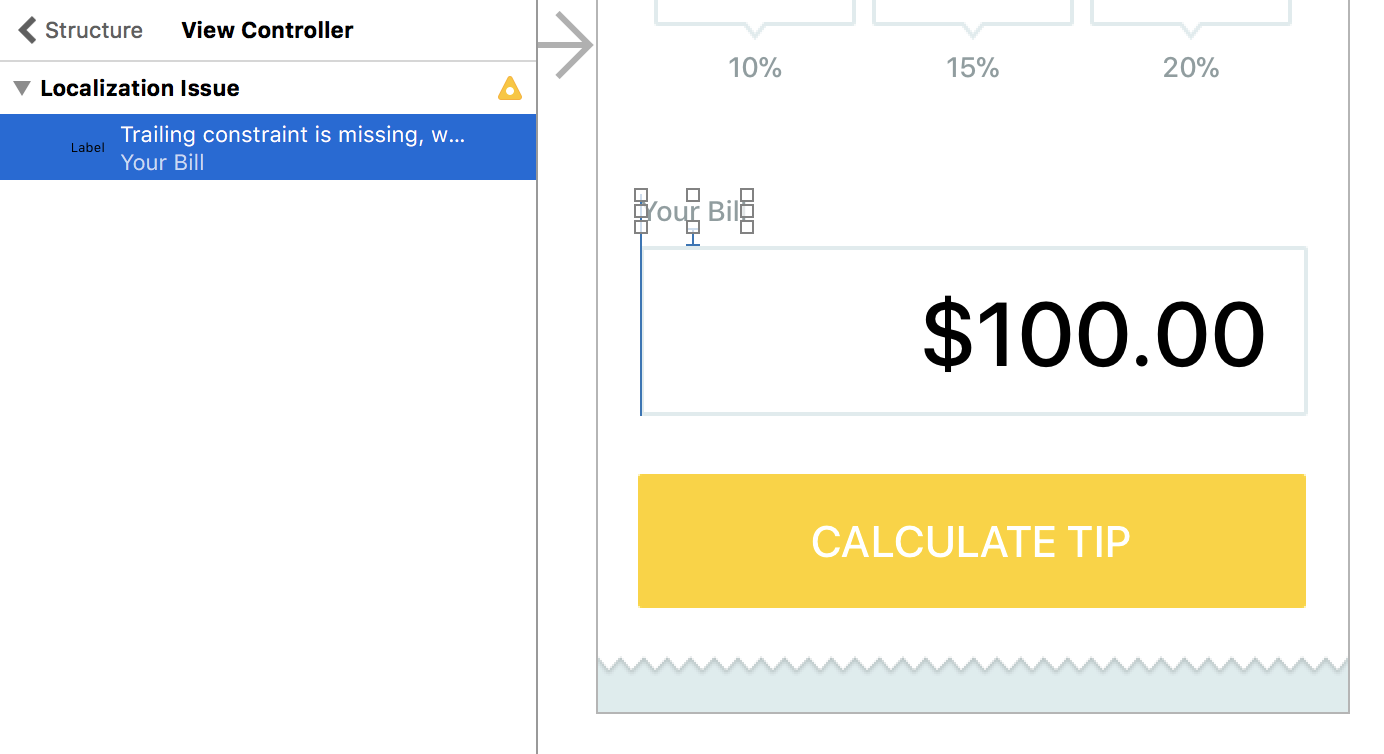
You can fix this issue by adding a trailing or leading constraint between the UILabel and the closest neighbor (or edge).
Fix it:
- Use a
>= 20constraint constant to the side of the device
OR
- Use a
>=8constraint constant to the edge of another UI element
Red: Layout Error
Ambiguous Layout
When rules can be interpreted in more than one way, you have an ambiguous layout.
This can happen if you have two areas that can both grow vertically. Not being specific on how they should grow creates an ambiguity.
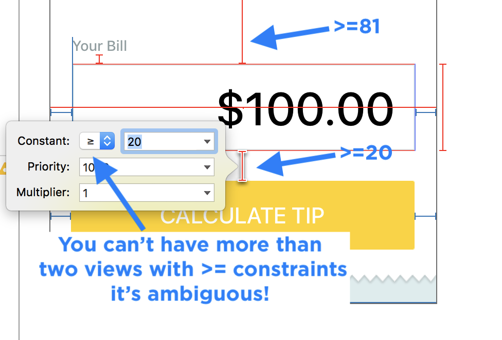
To fix the issue:
- Add more constraints to describe the relationship (i.e.: view A is 2x as big as view B).
- Or you need to make one of the constraints a fixed value (i.e.: equal).
Layout Conflict
Now imagine that both your boss and your direct manager give you instructions for work. One tells you to do X, and the other tells you to do Y. You have a conflict when X and Y are completely different things. Now you need to pick one of them to follow, but doing so will make one or the other upset.
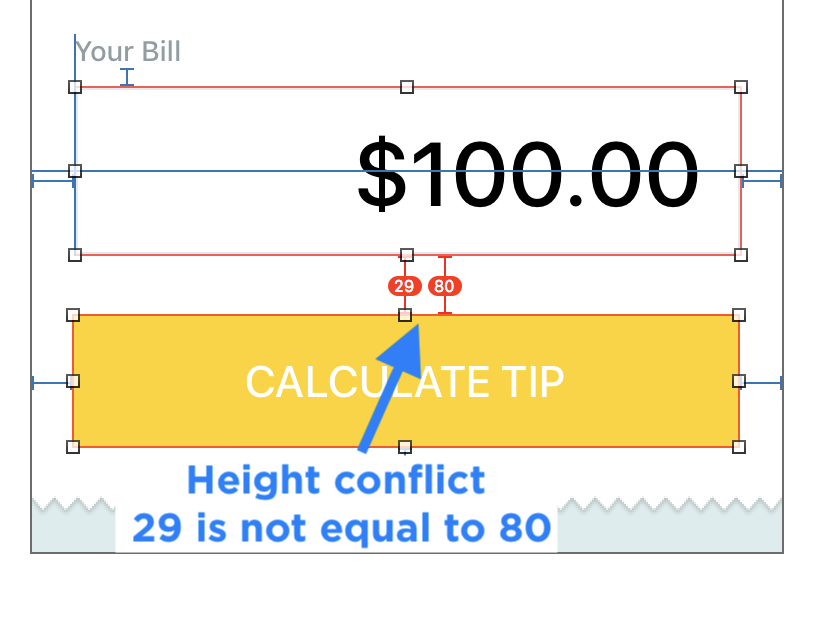
Missing Constraints
Imagine giving directions to a friend. If you leave one turn out of your directions, they'll get lost. Your directions were not complete.
The same is true with Auto Layout, you need to provide complete directions to the iPhone, so that it can position your content in the right spot.
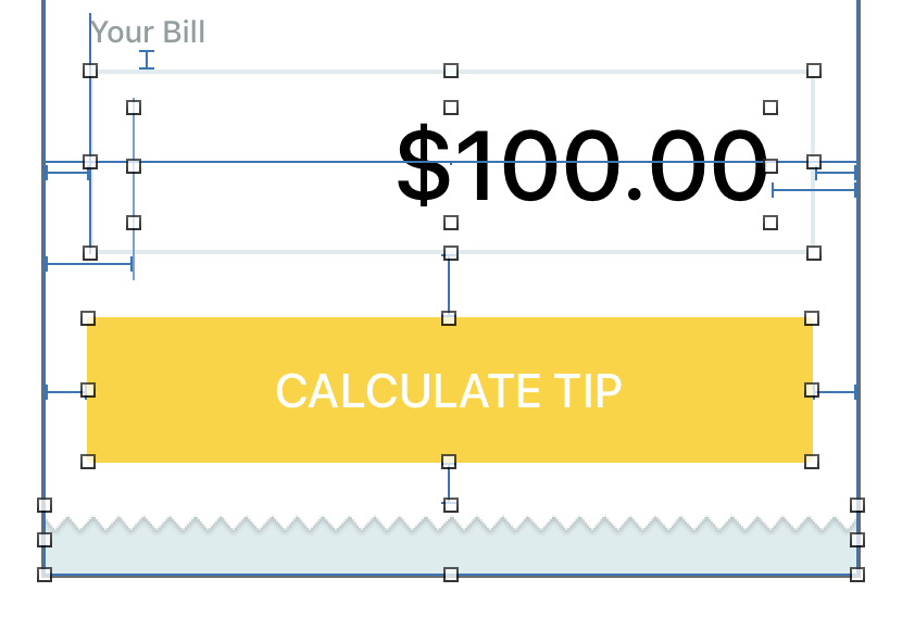
Even a simple mistake, or a missing rule can lead to lots of "Missing Constraints".
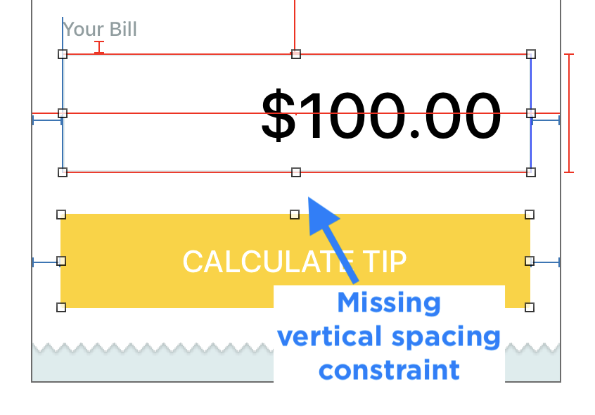
The vertical spacing constraint is missing between the "Calculate Tip" button and the box image around the total.
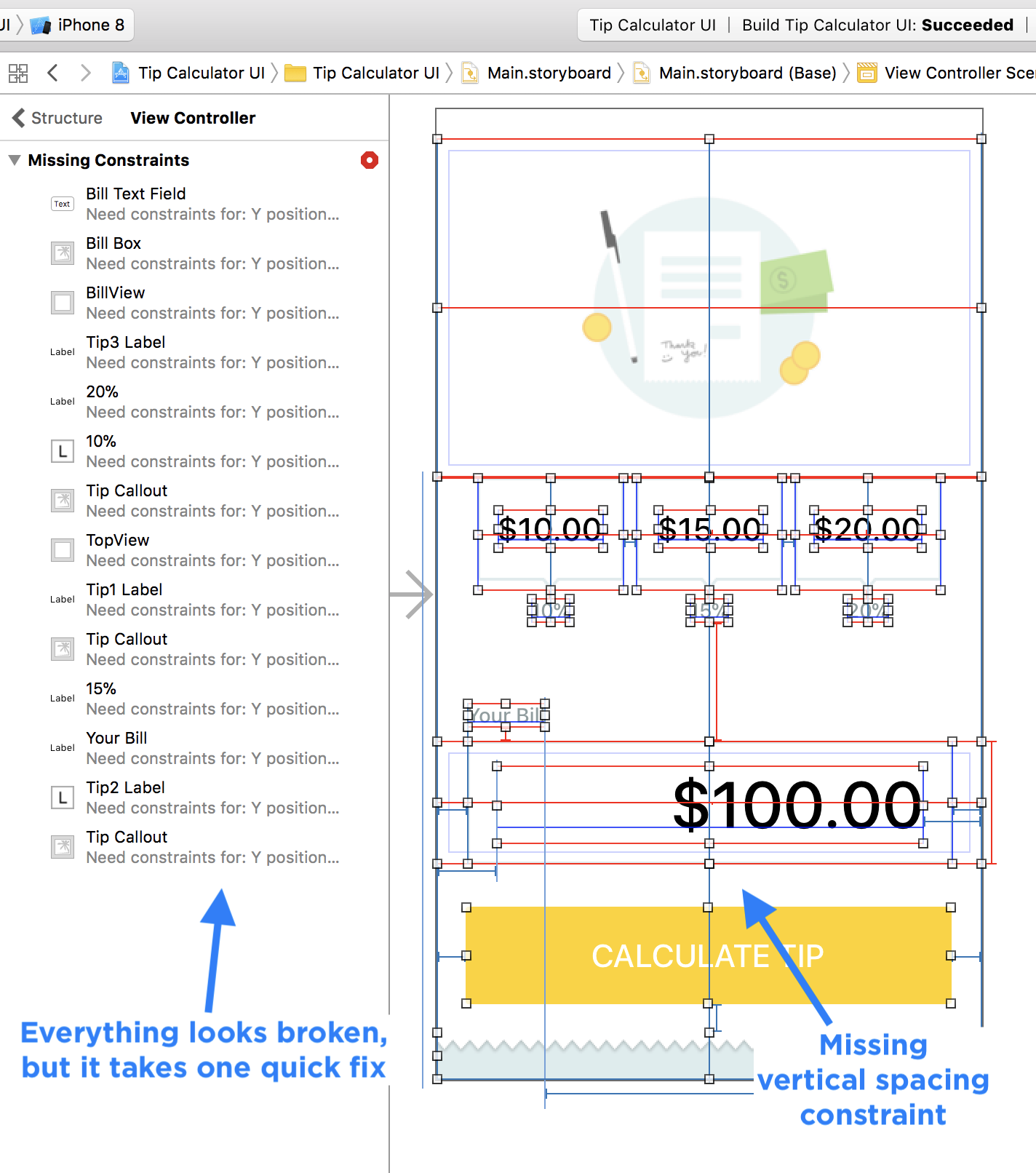
If you look on the hidden Auto Layout panel, it looks like everything is broken. Without this one constraint, none of the layout rules make sense.
Adding it back fixes every single error.
Broken Rules
When you have layout errors, your views, labels, and images will not appear where you expect. The iPhone will have to break one of your rules, or it might not have enough rules to describe the position and size of everything in your UI.
7. Work in One Direction
You should start top to bottom, and then move left to right.
When you haven't defined everything from top to bottom, there are still missing constraints (red), but you shouldn't worry yet.
Layout errors (red) are common when you are designing the interface. They should disappear when you finish, otherwise you have a problem.
Imagine Auto Layout like directions in a recipe. The dish is not complete until you follow all of the steps. It takes time to do each step, and you won't be able to judge the final result until you finish each step.
The same concept applies to Auto Layout:
- You need to describe all the vertical rules before the iPhone knows how to position your UI vertically.
- You need to describe all the horizontal rules before your iPhone knows how to position your UI horizontally.
For beginners the visual feedback can be confusing when you haven't finished adding all the layout rules.
The more you practice Auto Layout the easier it is to understand. Stop reading this guide and try it on a test app. Create a new Xcode project and add some images, buttons, and labels.
Workflow: Structural Layout
- Add constraints to the main content regions first to create your structure.
- Work top to bottom for anything UI element that will impact the overall height (structural).
- Work right to left for anything that will impact the overall width or horizontal placement (structural).
- Add constraints to any supporting
UILabelorUIView.
8. The Light at the End of the Tunnel
UI in progress is going to be hard to tell if it's done, since you need to provide all of the rules in both a vertical and horizontal directions. Keep on adding rules for each of the structural UI elements.
Until you finish describing the position and size of your UI elements in a complete area, or subregion you will still see lots of red and blue.
Don't worry if you see orange, it just means you may have nudged a view.
If you get stuck and it doesn't look right, undo the change and try it again.
And if you get really stuck, start over. I do this all the time, don't be afraid to learn from your mistakes by doing it again.
The more you practice setting up layout constraints, the more comfortable you will become.
9. The Hidden Layout Error Panel
Auto Layout errors do not display Fix-Its in the Issues Navigator where Swift code errors appear.
You will only see generic errors about ambiguous constraints, but it won't always tell you specifics.
Clicking the Warning sign on the top right corner of your Storyboard or .xib interface file will also not show you the exact warning.
Depending on the panels you have open, you might not even the hidden layout error panel.
Workflow: Show the Hidden Auto Layout Error Panel
You can display detailed errors and warnings about your Storyboard Auto Layout if you show the Auto Layout Error Panel.
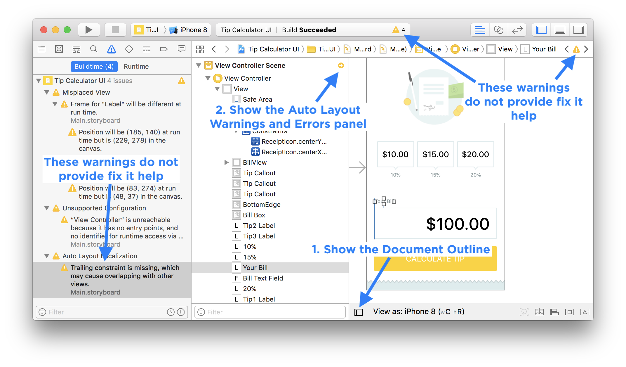
- Open your Storyboard file.
- Show the Document Outline with your list of view controllers (Bottom left corner of Storyboard file).
- Click on each screen (View Controller).
- Click on the tiny red or orange arrow next to the title
- Read each hidden error message (including the hover tips) to help you fix the problems.
- If you don't understand the error, do a Google search with the exact message.
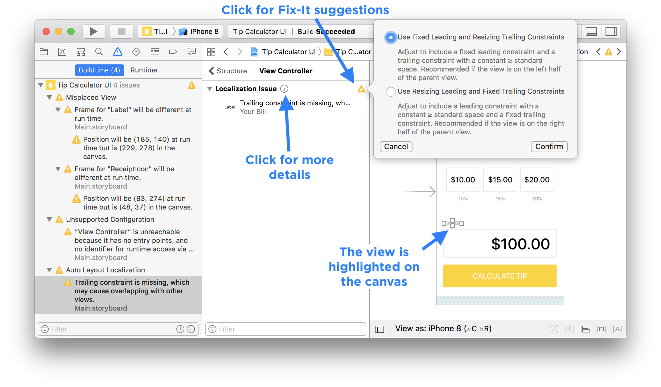
Seeing the actual warnings makes it a lot easier to figure out what's missing from your layout constraints.
The next background color trick is something I use all the time.
10. Change Background Colors
To understand how UIView's behave with Auto Layout you will want to visually see the size of a containing view (You have a "TopView" or "BottomView" with subviews that are centered or aligned to specific edges).
When you test your interface on large or small devices, the fastest way to see if your structure layout constraints are working is to change the background colors from Default (clear or white) to any color.
When I change colors for views that are touching (adjacent), I use different colors for each view. That way you can see the edges and verify they are stretching or compressing correctly.
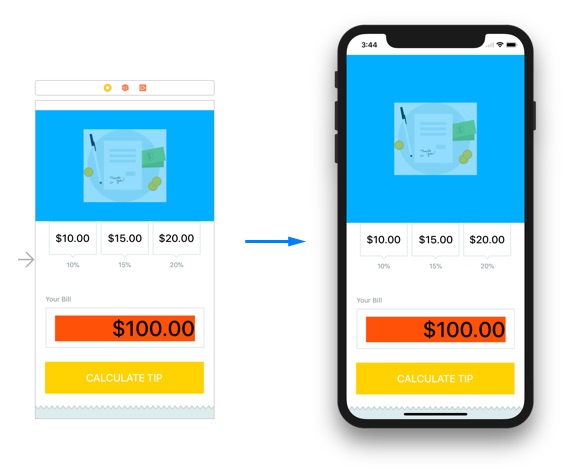
When you finish with your layout constraints, and you're satisfied that they behave correctly with the different iPhone simulators, you can revert the colors back to the Default color.
Any time something weird happens after I've tweaked a layout, I'll change the background color of the surrounding elements to fix the bug.
You can use this same trick for image graphics when you create custom @IBDesignable subviews. One version of the exported images will be "rainbow" colors and the other will be the final color of the app's theme.
Working productively with Auto Layout requires optimizing your mouse clicks and interactions.
11. The Diagonal Drag
The right-click and drag menu is a quick way for adding Auto Layout constraints. However, the context sensitive menu behavior is not helpful.
If you drag left or right you're wasting precious time and doing a lot of extra work.
The context sensitive menu tries to only show you the constraints that you might want in a vertical or horizontal direction.
However, many times it will hide the actual constraints you need.
To get around this quirk (Please report it to Apple), you will need to drag diagonally.
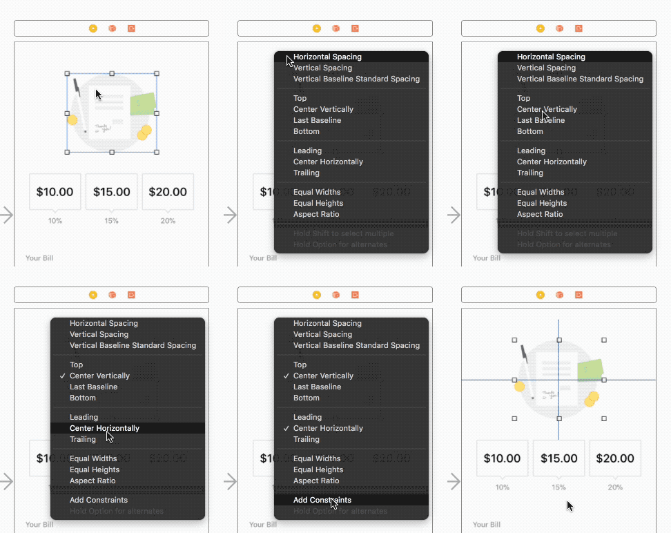
Many times the leading or trailing edge constraints are hidden if you just drag horizontally.
12. The Shift Key Modifier
When you use the context sensitive right-click and drag method of adding Auto Layout constraints, you can save mouse clicks by using the Shift key modifier.
After you click and drag, hold down the Shift key as you select multiple constraints to add.
Make sure you click the button "Add Constraints" to add the constraints, otherwise you'll need to do it all over again, since they won't add if you click elsewhere on your Storyboard canvas.
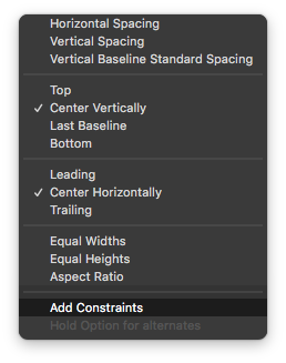
You cannot add all the layout constraints from the canvas.
13. Adding Difficult Constraints
You will need to use the Document Outline on the left of your Storyboard to add constraints using the click and drag method.
Adding layout constraints can be tricky with a complex layout.
- If layers are on top of each other, you may have trouble connecting constraints from the visual canvas.
- If you need to add structural constraints between your "Top View" and the top margin, there's no way to add that constraint on the canvas.
Workflow: Add Constraints to the Right Views
- Open the Storyboard Document Outline (Layer view)
- Right-click and drag from the canvas to the View
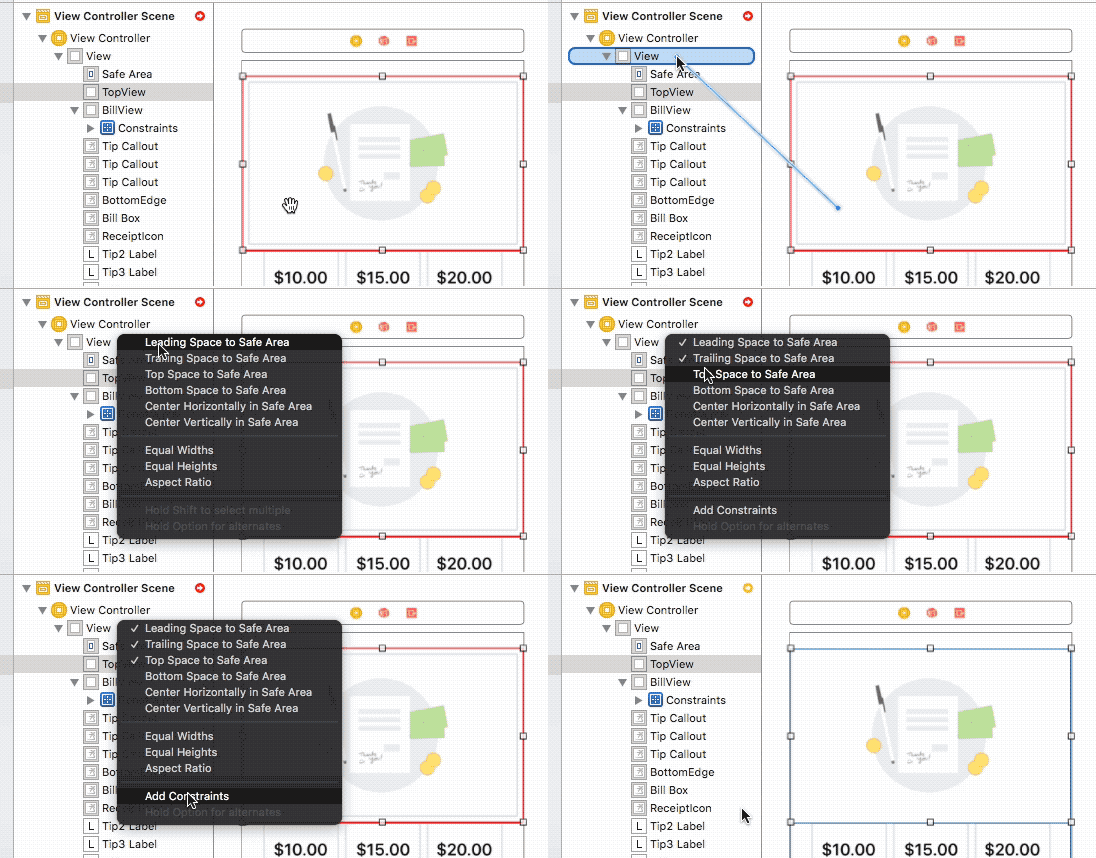
Tip: You can add constraints between views in the Document Outline layer list.
Again, hold shift after dragging to add the leading, top, and trailing constraints in one go.
It might seem that your constraints aren't working, when in fact they are. If you work with images the next tip will save you time.
14. Fix the UIImageView Content Mode
If you have a stretchable image, the default behavior of a UIImageView will be to center the content, not stretch it.
You will need to change the "Content Mode" on the UIImageView so that it can either "Scale to Fill", "Aspect Fit", or "Aspect Fill" to have the image fill the area correctly for different sized iPhone screens.

Not knowing about the Content Mode setting can make your Auto Layout constraints look wrong, and will leave you frustrated.
15. When to Use Stack Views
UIStackView's work well in certain situations and are the wrong choice in others.
The content in a UIStackView needs to be similar (i.e.: homogenous) or you're going to get strange layouts.
The UIStackView can work great with set of buttons or a custom @IBDesignable class or .xib interface file. But if you haven't spent the extra effort to create those "UI widgets", it might be the wrong solution for your UI layout.
You can learn how to create a an @IBDesignable class here.
From working with many beginner iPhone developers, I believe that you should start with manually laying out all the constraints to understand the behavior or UI elements and Auto Layout.
In my experience, a UIStackView can cause Storyboard performance issues if you have a lot of UIStackViews embedded inside of each other (i.e.: try making a math calculator UI using Stack Views).
Part of translating a design into a responsive iPhone app layout requires graphics that can resize without visual artifacts.
16. Design Resizable and Scalable Images
On iPhone X or iPhone 8 Plus your images need to fill the extra vertical and horizontal space.
A responsive app requires you to think in terms of stretching in either the vertical or horizontal directions (or both).
Buttons are typically stretched horizontally in apps, while cover photos might be stretched both vertically and horizontally to fill the space.
If you have a custom graphic for a callout widget, you might want to maintain an aspect ratio, yet support growing or shrinking the graphic (and related labels) based on the screen width or height.
Resizable graphics are easy if the design graphic is a solid color.
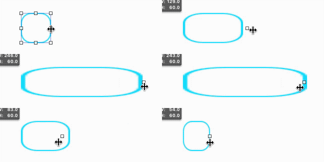
Resizing a button graphic with a gradient limits you to a horizontal direction, or you'll see the stretch skew your gradient colors and your rectangle's corner radius.
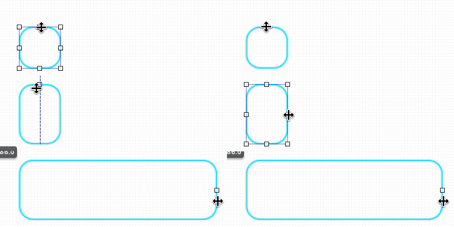
Resizing a button graphic that isn't designed to stretch with cause discoloration and graphics artifacts, which makes your UI look strange (Visual artifacts distract from the user experience).
17. Stretch Correctly with Image Slicing
Xcode has built in support for slicing images to make them resizable.
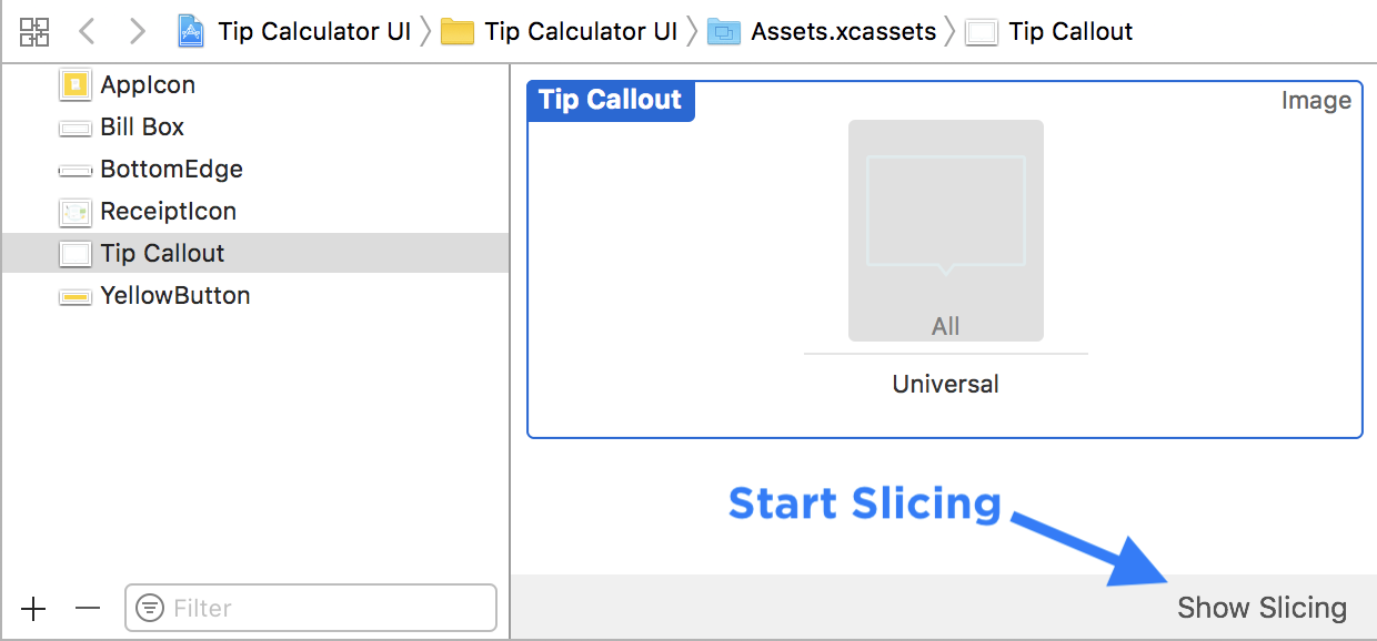
After you import an image into the Assets Catalog (Assets.xcassets) click on the image/vector on the left sidebar, there is an option hidden in the bottom right corner of the canvas to "Show Slicing."
Enable Slicing with the Asset Catalog
-
Select Your Asset Catalog file (Assets.xcassets or Images.xcassets) and click on an image.
-
Click on "Show Slicing" to enable slicing mode.
-
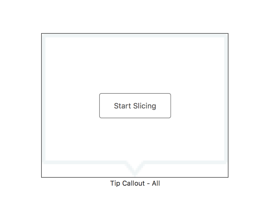
Enable slicing on each image that needs to be stretched by clicking on "Start Slicing" button.
-
Choose between horizontal, vertical, or both horizontal and vertical slicing.
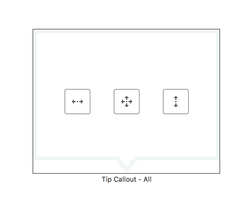
Keep in mind how your graphic is designed in order to make it stretch. The above "Tip Callout" image will only look good stretched vertical.
If you stretch the "Tip Callout" image horizontally the bottom arrow will be off to a side, or skewed.
Decoding Slicing Regions
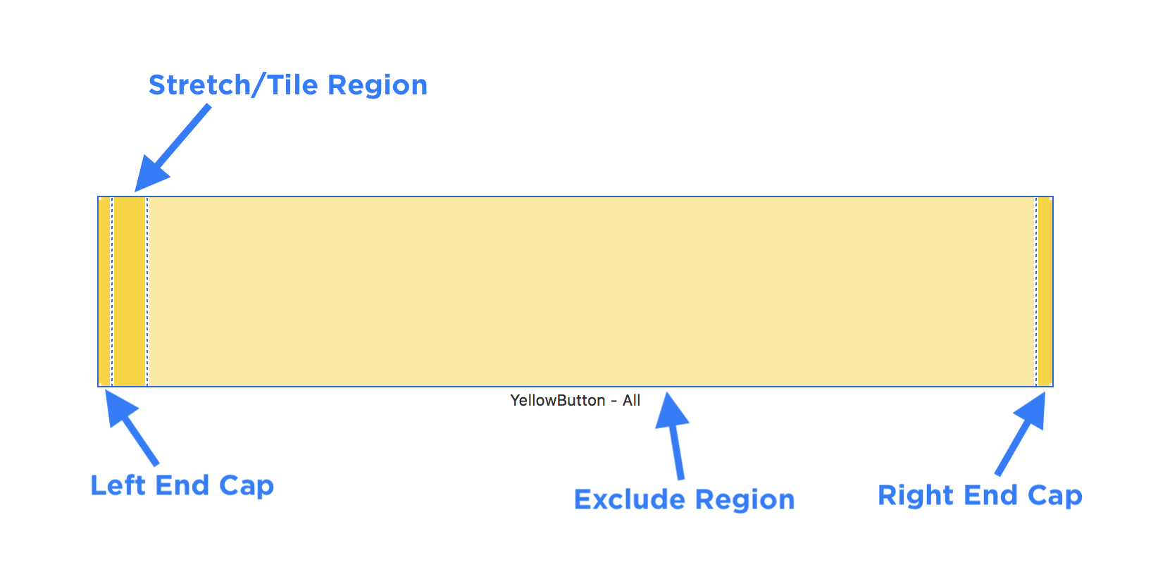
Xcode slicing will enable you to specify end caps (vertical and/or horizontal), a stretchable region, and an exclusion region.
-
If you want to make a button with a vertical gradient, you can use the asset catalog to define the end caps, which may have a corner radius.
It's important to give your end caps a big enough margin for your corner radius. Otherwise you'll see graphics artifacts when the image is stretched on iPhone. I generally set it to the corner radius size.
-
Next you define the region that will either stretch or tile when the button grows or shrinks.
-
Optionally, you can exclude part of the button graphic so that you can support smaller sizes. This area will look faded by 50%. You can skip this by making the exclude region 0 points wide.
The width of your graphic will determine how wide the button's intrinsic (or default) size appears on the screen (Storyboard canvas).
Stretchable graphics can always get bigger, but they cannot get smaller than their intrinsic size without visual artifacts.
18. Create Custom @IBDesignable UIViews
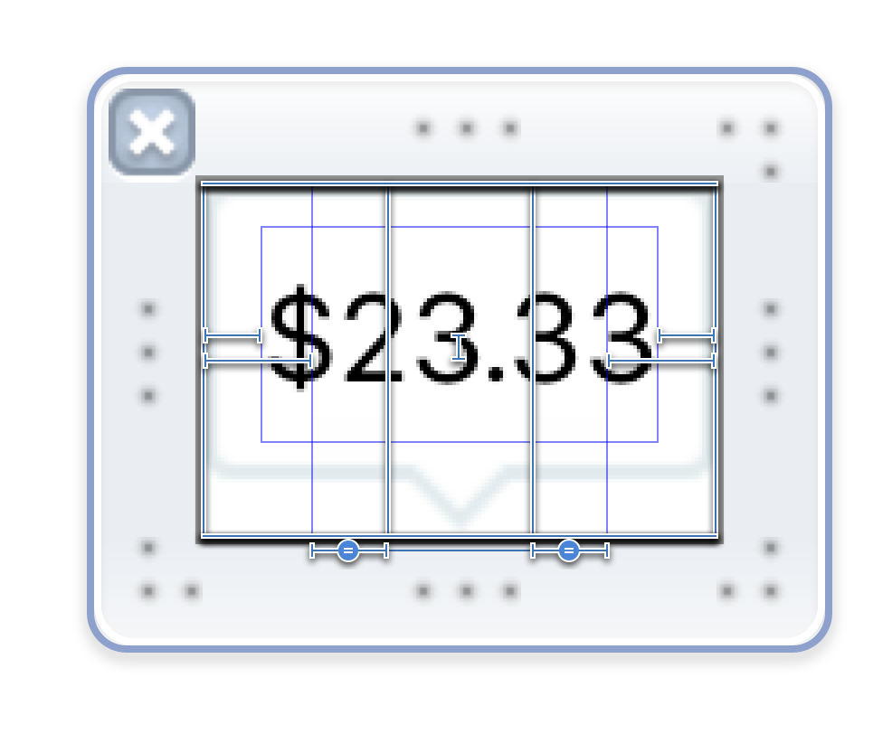
Using the strategies above for creating a complex stretching effect you'll need to create an @IBDesignable element if you want to layout the interface with Storyboard.
-
Make sure you describe all the horizontal and vertical constraints to pin the graphics to the edges, and to enable equal resizing.
-
You'll need to write some code to load the UIView from the .xib file, which you can find in my: @IBDesignable guide for custom UIView's with .xib files
19. Advanced Image Resizing
To achieve some visual affects you will need to break apart a design element into multiple images.
When you look at a graphic, there may be embellishments or frills that need to stay in specific positions.
For example, with this tip calculator callout, you want the bottom arrow to stay centered. If the graphic resized using one of the sides, the arrow would be aligned on the a side, and it won't align to the label that is centered below the graphic.
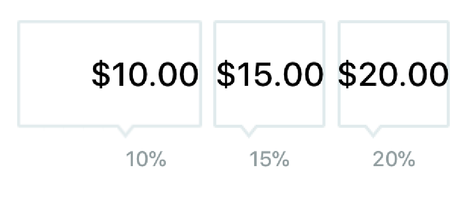
You have a visual disconnect that is very distracting for the user, and that doesn't match your design.
Break Down Design Elements Into Resizable Parts
To achieve some visual effects you need to separate a design element into it's components that can be stretched with Auto Layout constraints either in Storyboard files or programmatically.
For this effect you'll need at least three images/vectors, depending on how you slice apart and build the UI element. Compare the colored borders to the final composition to see how the graphics fit together.
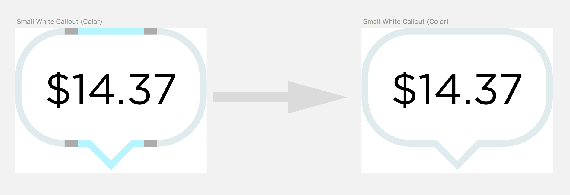
- Rounded rectangle (left + right end caps with a 15 point corner radius)
- Stretchable horizontal region
- Arrow pointing down
Important: These vectors are exported from separate Artboards in Sketch so that the vertical offsets align (Notice the white space below the vectors).
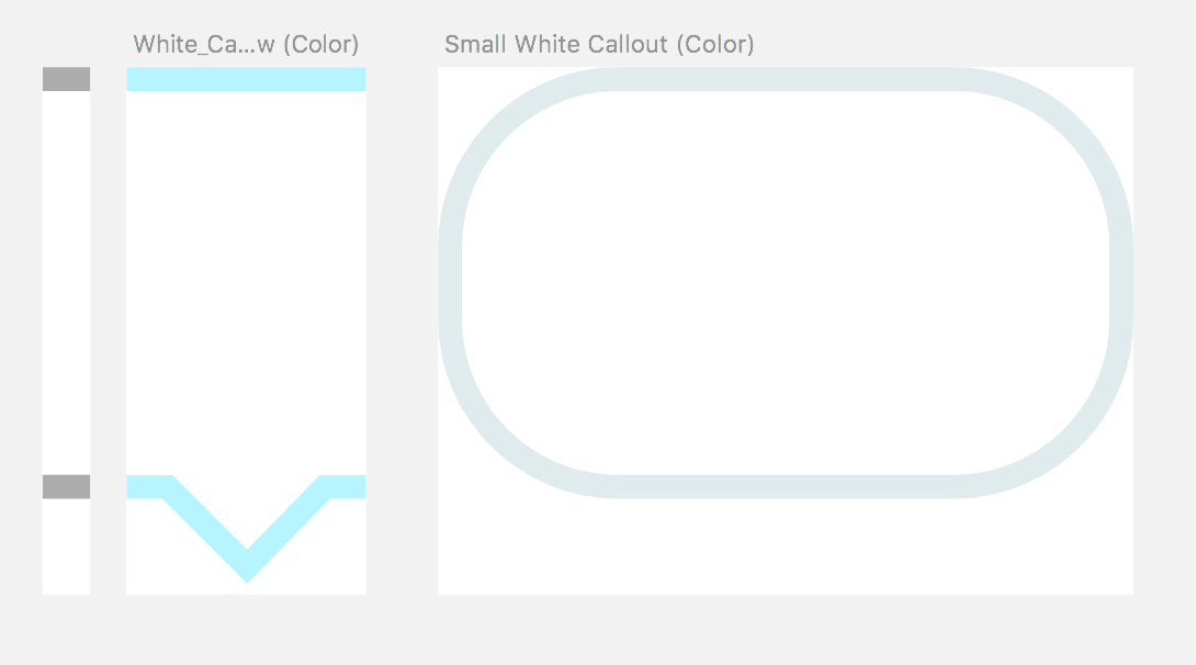
Some elements will be static sizes like the arrow and the left and right edges of the rounded rectangle. If you were to stretch these elements it will distort the arrow or the corner radius.
Reference the colored composition above to the parts. In the horizontal direction, I only want to stretch a portion of the horizontal bar that's on both the left and right sides of the arrow. The stretch region will need to stretch equally on both sides, or the arrow will be off center.
Since I'm using a rounded rectangle, the flat middle portion will also need to stretch in the center of the graphic. Xcode's slicing will make this work with minimal effort.
In Xcode you can create an @IBDesignable UI element with the horizontal UIImageViews using some vibrant colors to show regions.
@IBDesignable .xib Files
In Xcode you can create a programmatic @IBDesignable .swift file, or you can do the same thing using an .xib interface file.
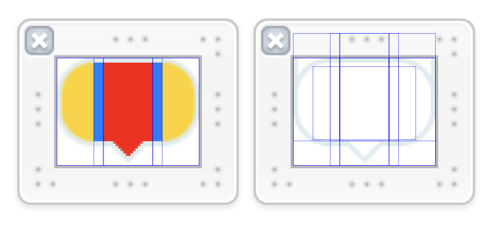
Tip 1: Show the bounds of each image when working with your Storyboard or .xib file:
Storyboard > Editor > Canvas > Show Bounds Rectangles
Tip 2: You can create multiple copies of your view to use the vibrant debug colors. These are good places to practice Auto Layout.
Final Custom IBDesignable Effect in Storyboard
Using an IBDesignable view makes a design customizable UI element that you can drag around your Storyboard file. It is adaptive and can stretch or shrink to different device sizes with the proper Auto Layout constraints.
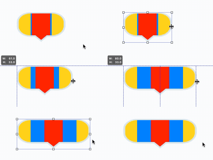
After the auto layout constraints are added, you can swap out the colored variations of the view with the white and gray style with a corner radius of 4.

Layer Breakdown
- Stretchable rounded rectangle (Left and right end caps)
- Arrow centered on top of rectangle
- Left stretchable region pinned a fixed distance from left edge and to the left edge of the arrow
- Right stretchable region pinned a fixed distance from right edge, and to the right edge of the arrow

20. Resizable UIImages using Swift 4 Code
You can achieve the same effects from slicing in Xcode using the UIImage's resizableImage(withCapInsets:, resizingMode:) method in Swift.
func resizableImage(withCapInsets capInsets: UIEdgeInsets,
       resizingMode: UIImageResizingMode) -> UIImage
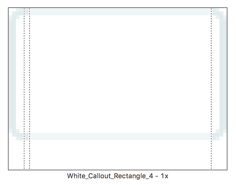
The following Swift 4 code will display a white rectangle vector with a corner radius of 4. Using a edge inset of 5 on all sides enables the graphic to resize without any distortions with the 4 point corner radius.
// Edge insets depend on the "points" used to design the graphic
let edgeInsets = UIEdgeInsets(top: 4, left: 4, bottom: 4, right: 4)
let resizableImage = UIImage(named: "White_Callout_Rectangle_4")?.resizableImage(withCapInsets: edgeInsets, resizingMode: .stretch)
let resizableImageView = UIImageView(image: resizableImage)
resizableImageView.center = CGPoint(x: 200, y: 100)
resizableImageView.bounds.size = CGSize(width: 200, height: 44)
view.addSubview(resizableImageView)
Tip: Changing the resizingMode to .tile enables you to create patterns that resize to fill an area.
Xcode Asset Catalog Effect Breakdown
-
White Resizable rectangle with corner radius of 4 points (right click to download this image and try it).

-
Enable horizontal Asset Catalog slicing (inset 4 points on left and right) with center excluded.
-
Rendered resizable
UIImageon iPhone X
Links
- UIImage Reference: Defining a Stretchable Image
- resizableImage(withCapInsets:resizingMode:) Reference
21. Advanced Constraints Editor
When you use the right-click and drag method to add constraints (or the align and pin buttons) Xcode will sometimes add the wrong constraint.
You can edit the details of any constraints using the constraint options on the "Measurement" panel on the right side.
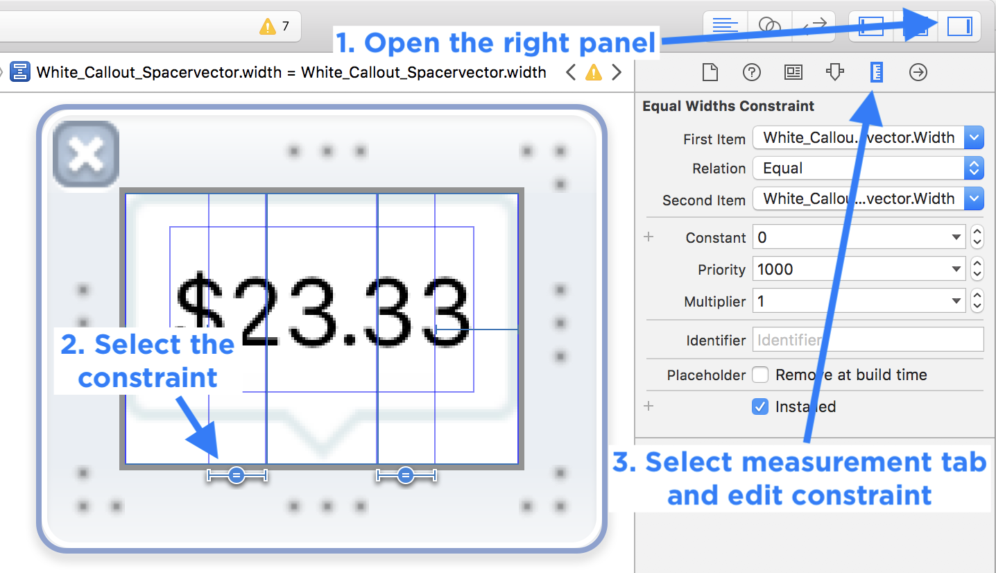
Let me know if you want to learn more about editing constraints in an upcoming tutorial: mailto:Paul@SuperEasyApps.com
22. Test Different iPhone Size Classes
After you add all your constraints for iPhone 8, you can now test what the constraints will do on different iPhone sizes.
Important: Only do this step after you add all the constraints for both the vertical and horizontal positions.
You may need to do a bit of problem solving to fix layout issues at this stage, since your layout should work perfectly for the iPhone 8 (if it doesn't fix those issues first).
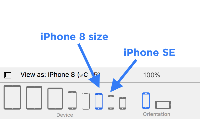
Generally I will test between the iPhone 8 and iPhone 8 Plus size first. Then I test for iPhone X. And lastly, I test for iPhone SE.
23. Fix Constraint Conflicts
Making changes later on is inevitable.
Adding a new view, or changing the distance between margins will cause your layout to break.
Typically the view will not disappear in the Assistant Editor Preview, but it will disappear when you run on a real device or simulator (along with any views that might be touching it).
Inequalities
There are situations where you may need to make a view height or width >= (greater than or equal to) or <= (less than or equal to) a size.
- If you want a view (or space) to grow in size use
>= - If you want a view (or space) to shrink in size use
<=
Workflow: Testing Your Layout Constraints on Different Size Classes
You can switch between different size classes (and devices) using the buttons on the bottom bar of your Storyboard file.
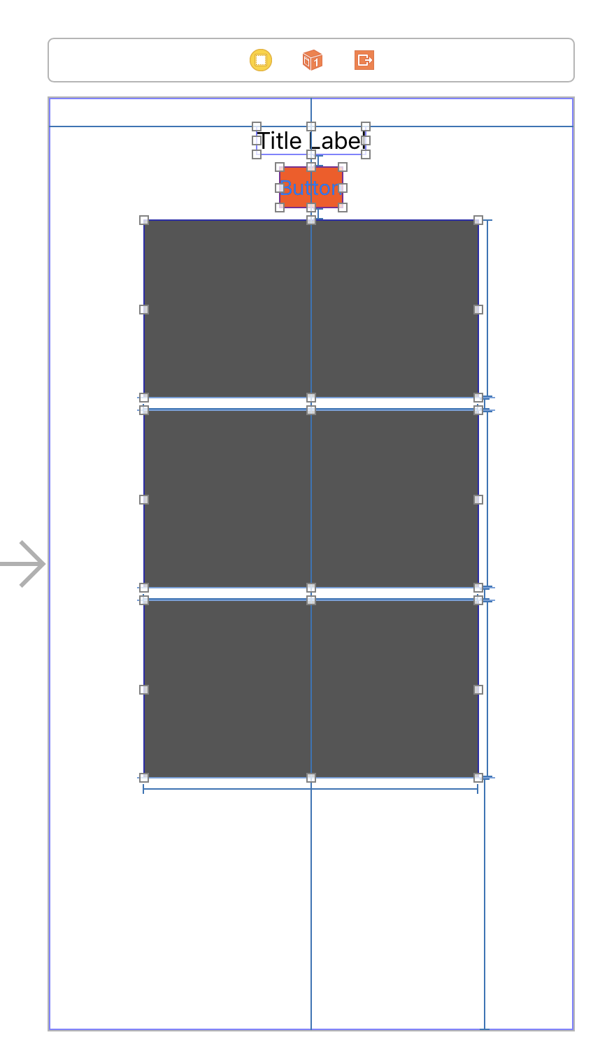
-
Add all your vertical and horizontal constraints.
-
Change your device size using the bottom screen buttons in your Storyboard file.
-
Check the error message for your layout conflict.
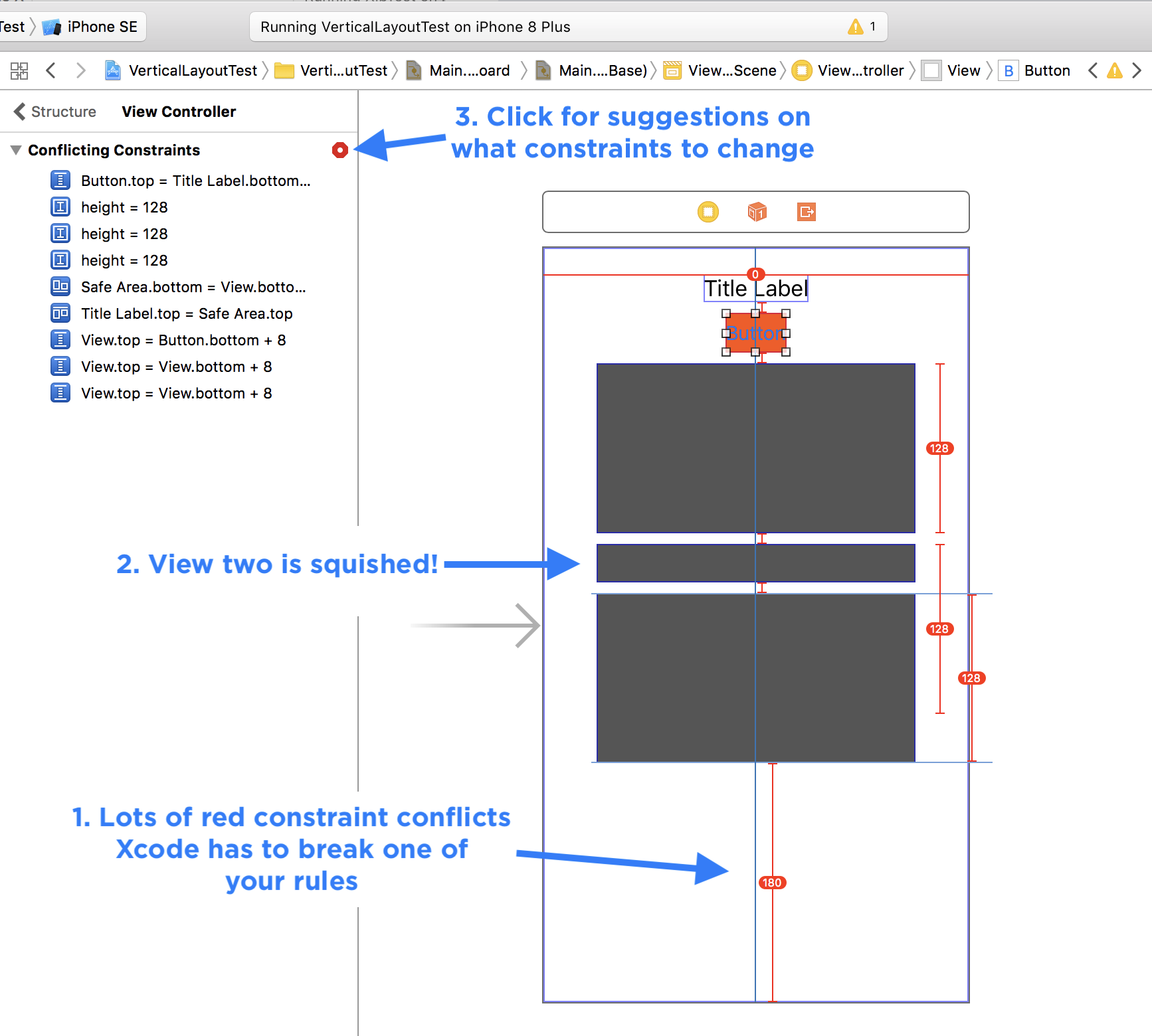
-
Fix any layout conflicts because your design had a fixed or rigid vertical height
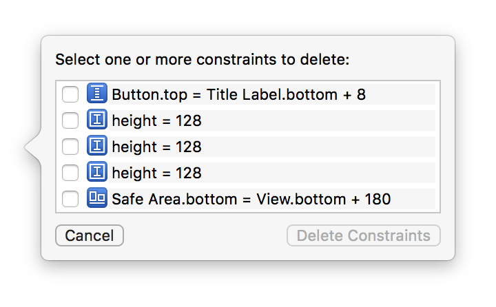
I work from top to bottom through the layout constraints and try to identify which constraint I think is causing the problem. In this case, it's because the bottom space is set to a specific size, which is impossible on a shorter iPhone SE.
-
The solution is to make this constraint
>= 20, instead of= 180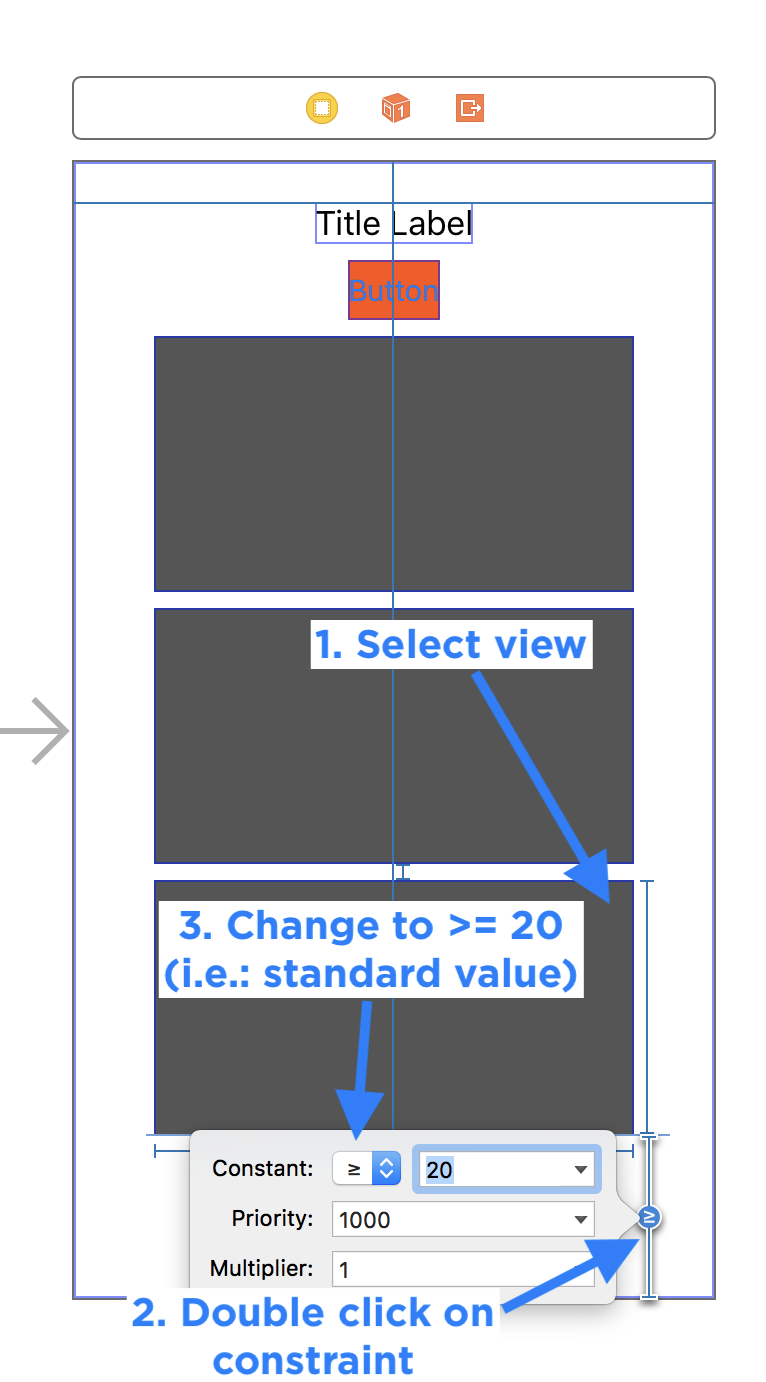
Updating Previous Constraints
After setting all the heights, you might need to add a new UILabel into the vertical layout.
- Remove one of the vertical constraints (on the tallest view).
- Add your new label.
- Updated any other constraints to make room for the spacing (it may be easier to remove all the constraints in the vertical direction and re-add them).
- Add new vertical constraints to finish vertical size.
24. The One View
As a rule of thumb, you can have one view that doesn't specify a rigid width or height in your overall vertical and horizontal structure.
This view can pick up any of the slack that you may need to properly space out elements.
More than two views without solid heights will cause ambiguous layout problems.
If you have more than two that need to grow and shrink, then you'll need to add additional constraints to describe how they should behave.
- Should they be equal in height?
- Should one be 2x as large as the other?
To do more complex layouts either you will need to use a Stack View to help describe spacing, or you will need to add hidden UIView's that can have equal width or height constraints.
25. Frames vs. Constraint Constants
When you see dashed orange lines the Storyboard canvas layout will not match the UI layout when you run your app on your device or iPhone Simulator.
You have two options:
- Update the frame (i.e.: use the original layout constraint position/size of the view)
- Update the constraint constant (i.e.: use the new canvas position/size of the view)
Update Frames
Frames in the context of Storyboard files with Auto Layout are the canvas positions of the UI that you have dragged onto the main view.
The frame describes both the origin (x and y position) and the size (width and height) in terms of points on the screen.
When you add a layout constraint, or when you nudge a view around the Storyboard canvas, it may change some of your view's frame values. But this change will not propagate into Auto Layout rules.
-
Sometimes you want to use the current canvas value (what you see in the Storyboard editor) for the position and size of a view. You'll need to Update Constraint Constants to keep the new position.
-
Other times you want to use the new frame position based on the Auto Layout constraint. You'll need to Update Frames for the selected views to use the original position described by your layout rules.
Workflow: Make an Auto Layout Change (Update Constraint Constants)
When you want to move a view, you will need to update any Auto Layout constraints that have been previously set.
-
Add layout constraints to describe size and position
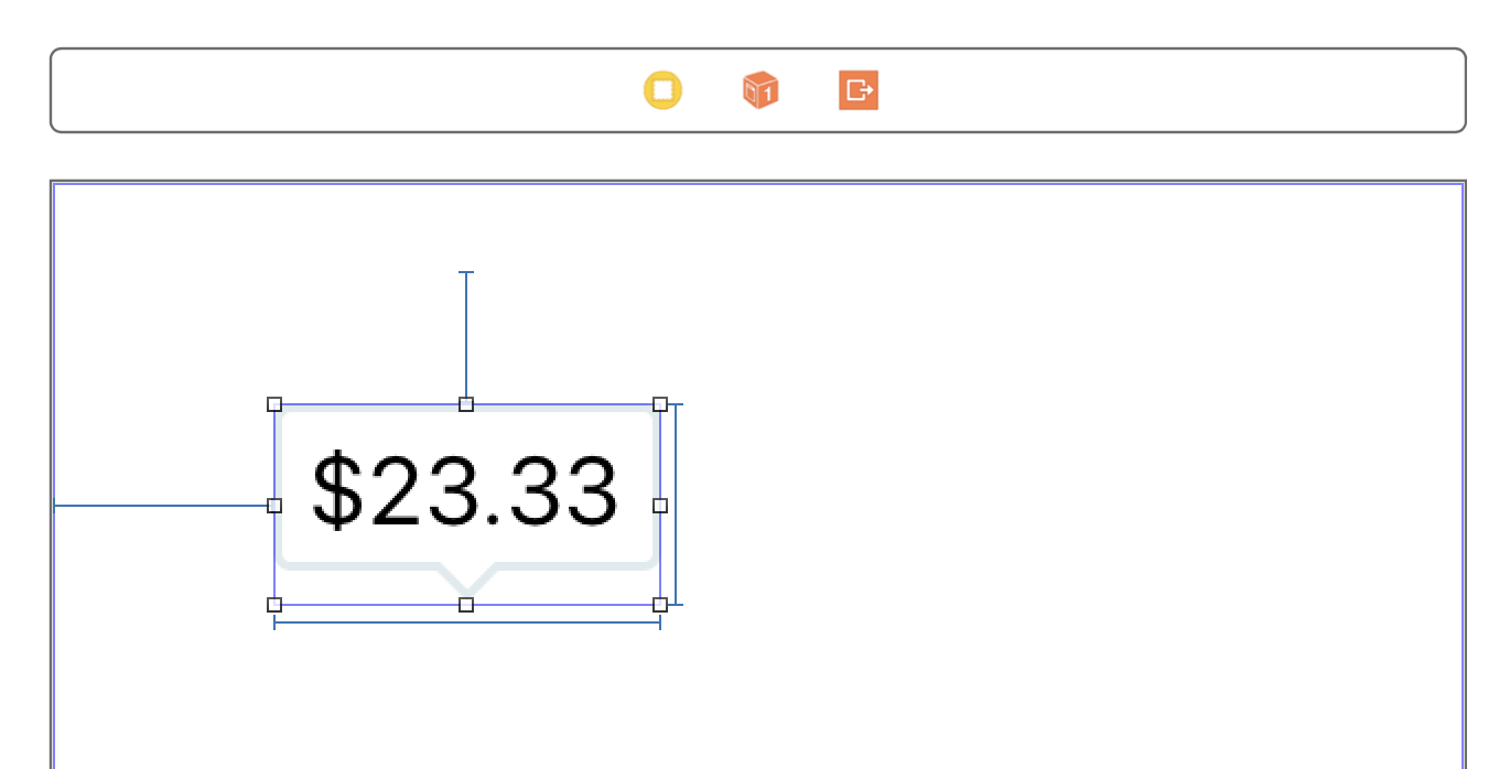
-
Move the view and see how the layout constraints are dashed orange lines (misplaced views)
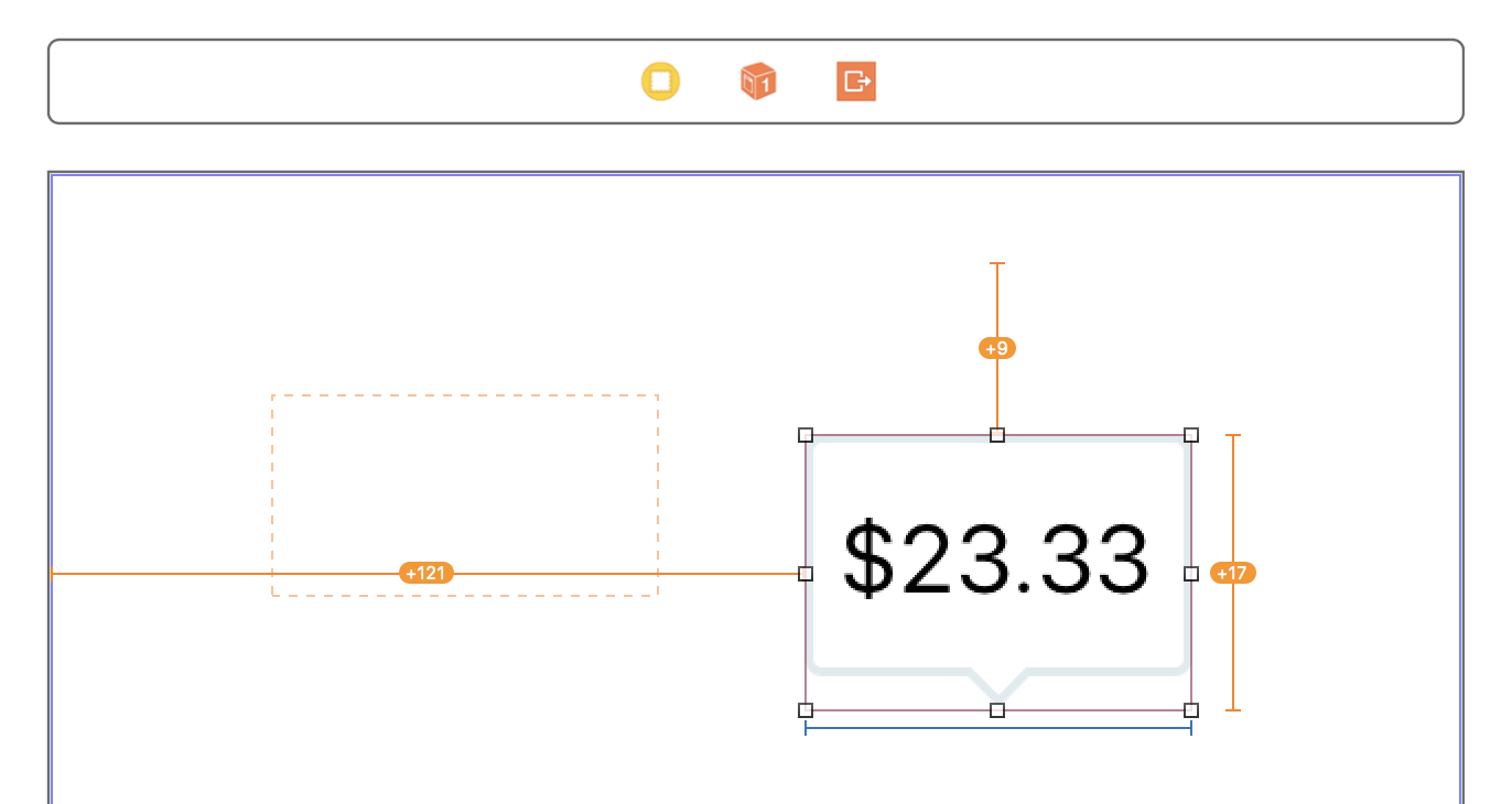
-
A misplaced view means the frame on the Storyboard canvas does not match the frame on the iPhone at run-time.

Tip: You can use the Xcode Fix-it suggestion from the Auto Layout error panel. Read the descriptions to understand the problem.
-
Running the app with a misplaced view will show it in the original spot that the Auto Layout constraint used
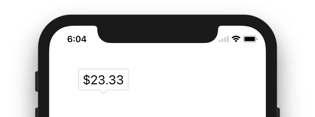
-
You can force the new frame position by using the "Resolve Auto Layout Issues" button in the bottom corner of the Storyboard canvas. Choose "Update Constraint Constants" for the "Selected Views".
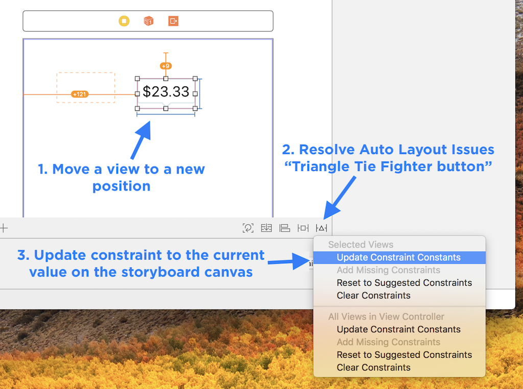
Workflow: Revert a Layout Change (Update Frames)
As you click around your Storyboard file, you may miss-click. If that happens and you accidentally move a view, you can move it back using a quick button press.
-
Click on the left-most button on the bottom panel of your Storyboard canvas called "Update Frames"
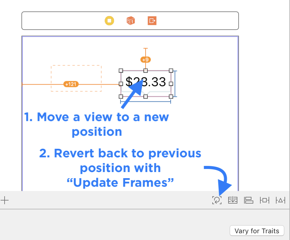
26. Iterate Quickly with Copies
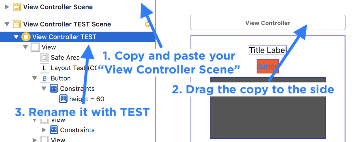
You can always duplicate a complex UIViewController and then apply changes, and see if you can get things working.
-
Copy and paste your "View Controller Scene"
-
Clear the constraints and add them again one at a time.
-
You can switch between the main view controller by dragging the "Storyboard Entry Point" arrow to your copy.
27. Backup Auto Layout
You should be backing up your work with version control. Git is the best, since it is built into Xcode and your Mac.
Git enables you to track changes like you might do in Word when writing a paper with a group.
You can see who made a change, and when. Sometimes you might not even remember making the change. You can go back in history before you broke a feature, which is why version control is so useful for apps.
Use one of these two strategies with your iPhone apps:
Workflow: Easy Backup Strategy
-
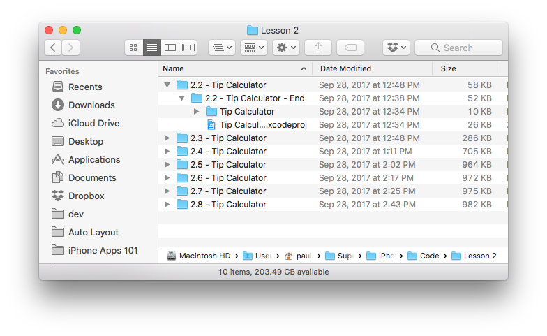
Create copies of your entire Xcode project as you make incremental changes using Finder's "duplicate" option.
-
Rename each copy something meaningful, or just increment the version number like "2.2 Tip Calculator" and then "2.3 Tip Calculator"
Workflow: Git Version Control
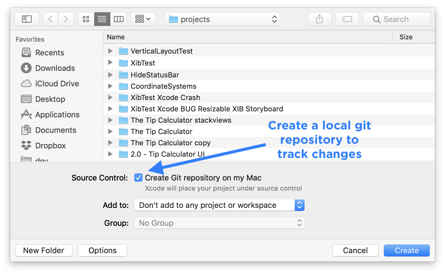
Use Git locally with your project and make commits as you work.
I use <Github.com> for all my source code. I don't feel comfortable not having it backed up to the cloud in either a public or a private repository. Check out my public code: http://github.com/PaulSolt
-
In Xcode when you create a new project, Check the "Create Git repository on my Mac"
-
Commit changes as you work after completing bug fixes or adding new features using:
Source Control > Commit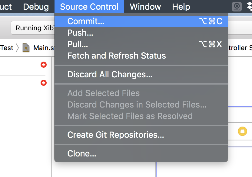
-
Describe what you changed and click "Commit"
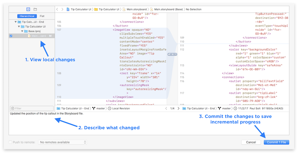
Let me know if you'd like more insight into how to use Github and Git. mailto:Paul@SuperEasyApps.com
At the very least you now have a way to "go back in time" if you break something.
If you connect your local git repository to your own GitHub account, you'll be able to protect against losing code if your hard-drive crashes or if someone steals your laptop.
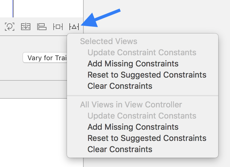
28. Clear Constraints and Restart
If you get stuck, just start over.
-
If things don't work out, you can just select the problematic
UIView's and clear the constraints.Click on the "Triangle Tie Fighter" button > Selected Views > Clear Constraints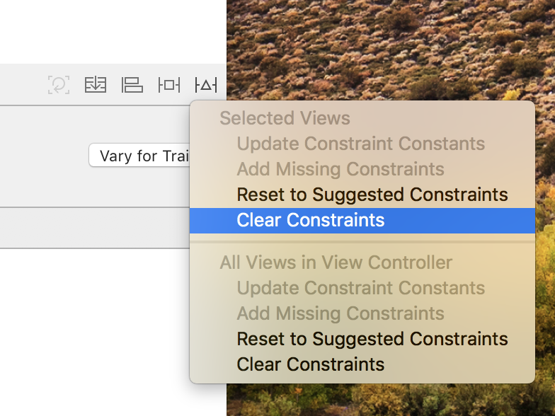
-
Or you can start over again and just clear all constraints in the current
UIViewController.Click on the "Triangle Tie Fighter" button > All Views in View Controller > Clear Constraints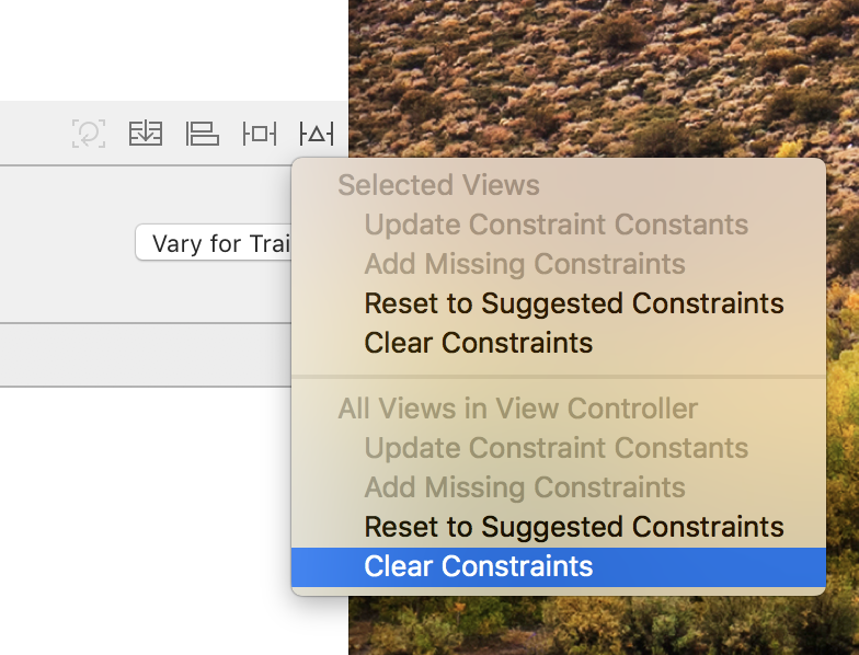
29. Alignment and Tie Fighter Buttons
The bottom right corner contains three buttons that are very useful in quickly adding new constraints to multiple views.
Align Button
You can align multiple views together, or to a superview (the containing view).
Make sure you select multiple views before you click the align button.
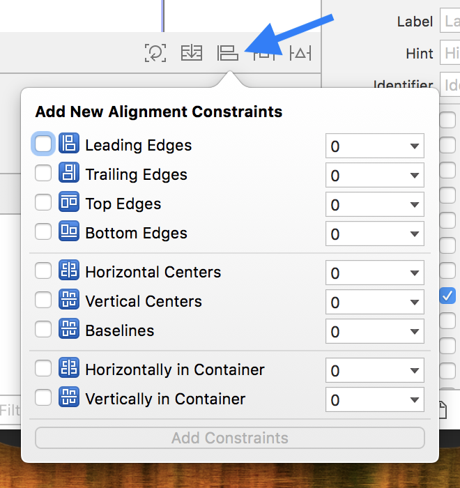
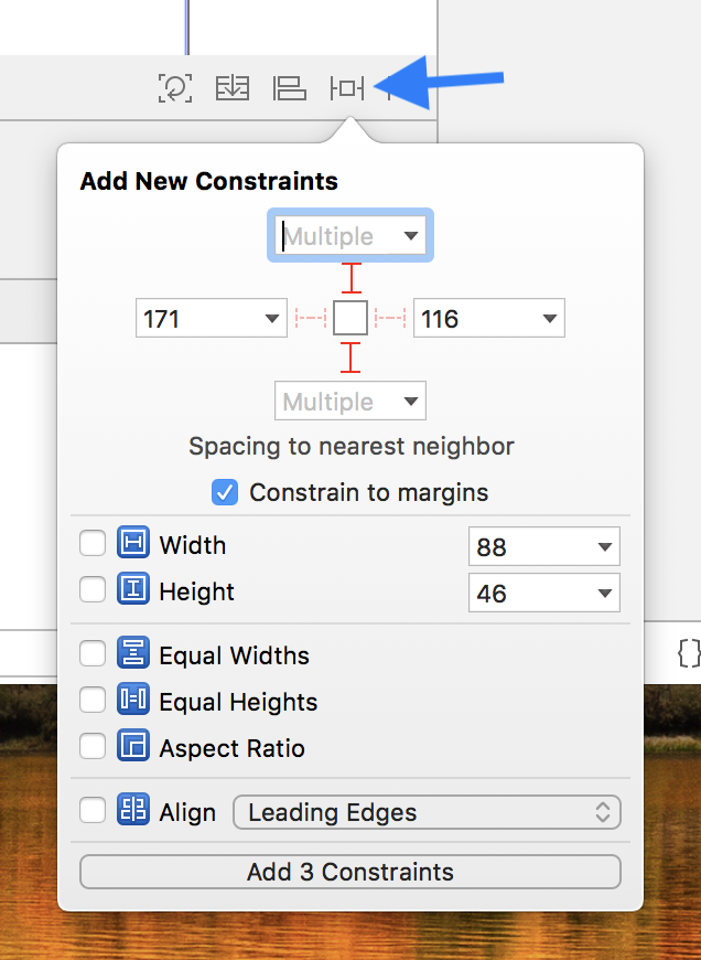
Square Tie Fighter Button (Add New Constraints)
You can add multiple constraints in less clicks using the "Add New Constraints" button.
After you understand how constraints work, this button can save you time.
Triangle Tie Fighter Button (Resolve Auto Layout Issues)
Use this button to clear constraints or to update constraint constant values.
30. Don't Use These Settings
Avoid the options to "Reset to Suggested Constraints" and "Add Missing Constraints".
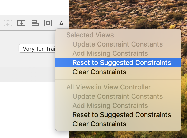
It might seem like a quick fix, but it rarely ever adds the constraints you really want. Xcode can't automatically create rules if you don't know what you want the UI to do.
In a pinch, it might help you diagnose a problem, but most likely it will just pin the element incorrectly.
The few times I use the "Reset to Suggested Constraints" button I immediately undo what Xcode adds and do it again myself. My other problem with this "magic" button it is that you have no idea what changes unless you painstakingly undo and redo. You should be able to reason about all the rules in your interface, it shouldn't be magical.
Understanding layout and where things need to get pinned, and the relationship between your user interface elements is something that you need to figure out.
Download the 30 Auto Layout Best Practices PDF
Download the Auto Layout Toolkit and get the Auto Layout 101 video and the 30 Auto Layout Best Practices PDF.
Please let me know what tip is the most helpful. Write a comment below, or send me an email: mailto:Paul@SuperEasyApps.com.
If you have any tips, please share them. I can't wait to see what you create!
Thank You!
Let me know if you learned anything from the 30 Auto Layout Best Practices. Send me an email to mailto:Paul@SuperEasyApps.com
If you're interested in my Learn Auto Layout Fast course, signup below.
Learn More
If you're looking for more resources, checkout my course called Learn Auto Layout Fast
