
How to Create Round Buttons Using @IBDesignable on iOS 12
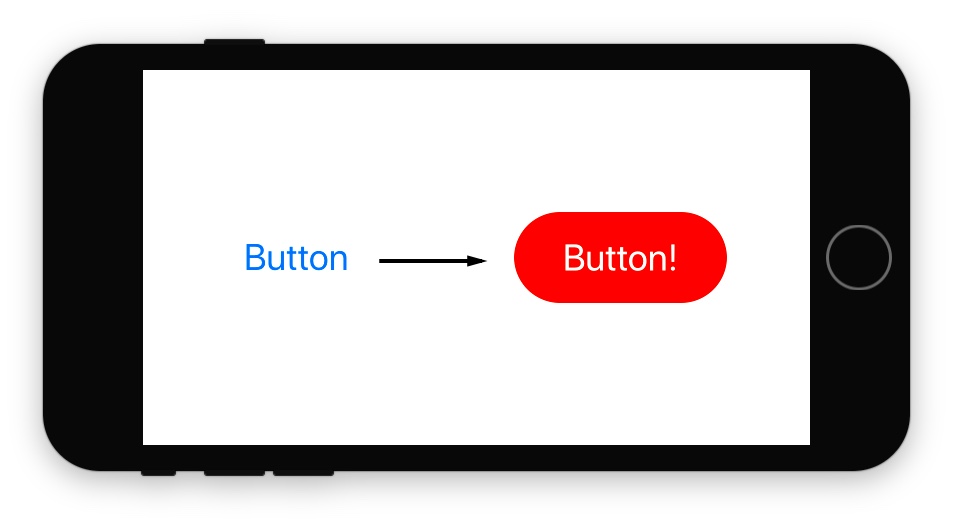
Buttons in Xcode Storyboards require a bit of work to customize, especially if you want a solid background color and an easy to edit corner radius.
Unfortunately there isn't an easy way to change the corner radius in a Storyboard file with a system UIButton.
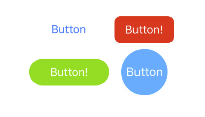
Rounded Button Solutions:
- Create the button programmatically
- Create different art assets
In this tutorial you will learn a new approach that combines the best of both worlds (code and Storyboard files) using the @IBDesignable UI elements.
You can leverage this approach for other UI elements in your application to create image free, pixel-perfect rounded buttons (or dialogs and other views).
Download the 11 Step @IBDesignable PDF
Get the source code and the 11-step guide for creating @IBDesignable UI elements for iPhone apps.
You can reference this guide quickly when you make your UI more design friendly, so that you can iterate faster.
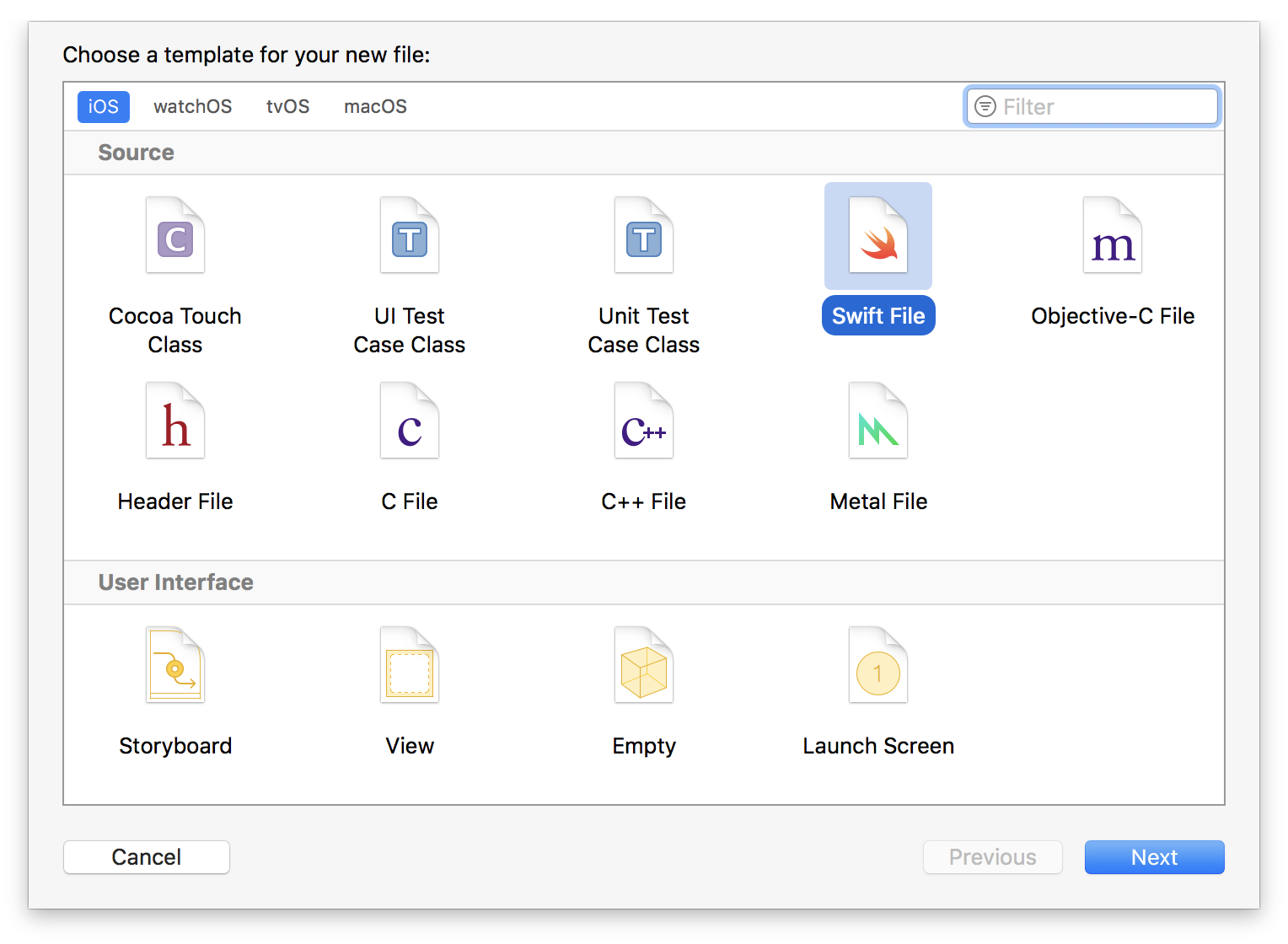
1. Create Swift Code File
Create a new Swift code file called: RoundButton.swift
2. Subclass UIButton and make it @IBDesignable
@IBDesignable is a special attribute that allows the Storyboard file to see our custom UI element and it will actually compile the code for the Storyboard.
Subclassing the UIButton allows you to use the system animations and default button behavior for free. You won't have to mimic the button fade animation in code.
import UIKit

@IBDesignable class RoundButton: UIButton {

}
3. Create the Common init Logic
Buttons can be created in multiple ways: either programmatically or via the drag and drop Storyboard/.xib interface files.
You will need to have common setup logic, otherwise your buttons will behave and look differently between the Storyboard file and iPhone Simulator (and if you create them programmatically).
Add the initializers, prepareForInterfaceBuilder() and the sharedInit() function:
@IBDesignable class RoundButton: UIButton {

    override init(frame: CGRect) {
        super.init(frame: frame)
        sharedInit()
    }

    required init?(coder aDecoder: NSCoder) {
        super.init(coder: aDecoder)
        sharedInit()
    }

    override func prepareForInterfaceBuilder() {
        sharedInit()
    }

    func sharedInit() {
        // Common logic goes here
    }
}
Three separate initializer functions are called based on what context the RoundButton is created in:
init(frame:)is for programmatically created buttonsinit?(coder:)is for Storyboard/.xib created buttonsprepareForInterfaceBuilder()is called within the Storyboard editor itself for rendering@IBDesignablecontrols
You want to leverage code reuse to make each button look the same—no matter where or how you create it by using a single function (the less code you write the less bugs you'll have).
4. Create Rounded Corners Using CALayer Properties
The CALayer properties have an attribute that you can change to create a cornerRadius on any UIView.
Add a helper method named refreshCorners() to update the corner radius:
func refreshCorners(value: CGFloat) {
    layer.cornerRadius = value
}
5. Create an @IBInspectable Attribute for Rounded Corners
Inside "RoundButton.swift" at the top of the RoundButton class, add an @IBInspectable attribute:
@IBInspectable var cornerRadius: CGFloat = 15 {
    didSet {
        refreshCorners(value: cornerRadius)
    }
}
@IBInspectable variables are exposed to the Storyboard UI, which allows you to change these properties via the "Attributes Inspector" when editing a RoundButton.
Set a default value of 15 for cases when the user (i.e.: developer) doesn't change the attribute.
Use the didSet computed propetry to update the visuals anytime the cornerRadius is changed in code or via the Storyboard file.
6. Update the Corner Radius
Make sure you add a call to refereshCorners() in your sharedInit function to keep the behavior consistent:
func sharedInit() {
    refreshCorners(value: cornerRadius)
}
This step will make sure the layer.cornerRadius value is set to the default of 15 when the RoundButton is created (Otherwise you'll see differences between when you run the iPhone app and what you see in the Storyboard file).
7. Create a UIButton in main.storyboard
-
Drag a
UIButtononto the iPhone canvas. -
Set the Background color to blue (or any color you choose).
-
Set the text (i.e.: Tint color) to white.
-
Open the
Identity Inspectorand set the Class attribute toRoundButton.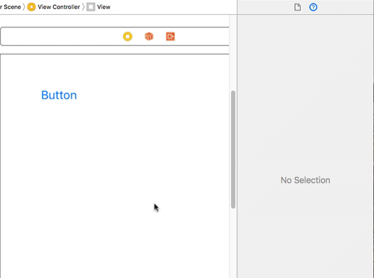
-
After you set the
UIButton's Class toRoundButton, you get a separate option to adjust the corner radius in the "Attributes Inspector".
8. Reuse Apple's System UIButton Fade Animation and Behavior
Try the button on your iPhone or the iPhone Simulator.
How does it behave?
Compare it to a standard button, and look at the animation.
It's not the same ... but you can fix it to use Apple's button fade animation.
The UIButton's background color property was functional, but it doesn't have the same behavior as a system button (without additional work).
You can get the behavior by using the UIButton's background image, but you would need an image of every color.
Instead of creating tons of images for any possible color, you can write a little code to programmatically create a 1x1 pixel image.
9. Create a Colored UIImage Programmatically
Create a function that will create a UIImage programmatically:
func createImage(color: UIColor) -> UIImage {
    UIGraphicsBeginImageContextWithOptions(CGSize(width: 1, height: 1), true, 0.0)
    color.setFill()
    UIRectFill(CGRect(x: 0, y: 0, width: 1, height: 1))
    let image = UIGraphicsGetImageFromCurrentImageContext()!
    return image
}
This function is a little complex if you're new to computer graphics:
-
UIGraphicsBeginImageContextWithOptionsis called, creating a blank 1x1 pixel graphics buffer in memory (i.e.: image). -
The
color.setFill()sets the color for any draw operations that follow. -
UIRectFill()is a Core Graphics routine that can paint a rectangle with the set fill color. -
The last step renders an
UIImagefrom the open graphics context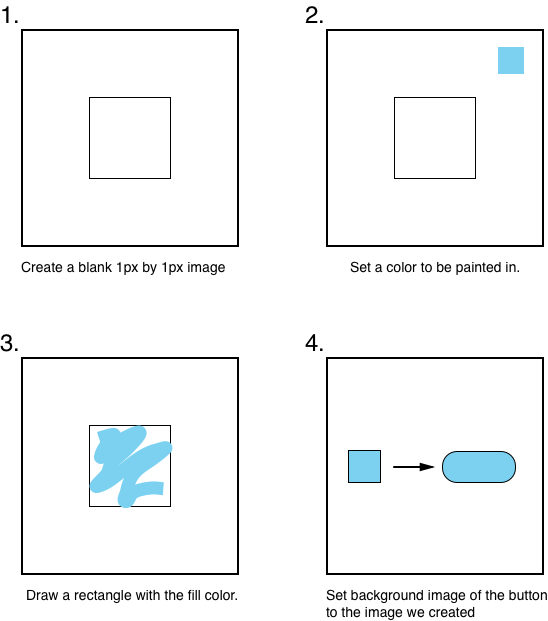
10. Create an @IBInspectable UIColor Property
You can create UIColor properties that are @IBInspectable and let the user pick a color using Xcode's built-in color picker.
-
Create a function to update the color of the
UIButton's background image:func refreshColor(color: UIColor) { let image = createImage(color: color) setBackgroundImage(image, for: UIControlState.normal) clipsToBounds = true }Creating the image and setting the backround image are fairly self-explanitory, but
clipToBoundsneeds to be enabled, otherwise the corners will not rounded (which is kind of the point of this tutorial). -
Create a
@IBInspectablevariable for the background color namedbackgroundImageColorand call therefreshColor(color:)method:@IBInspectable var backgroundImageColor: UIColor = UIColor.init(red: 0, green: 122/255.0, blue: 255/255.0, alpha: 1) { didSet { refreshColor(color: customBGColor) } }The logic is similar to how the corner radius worked, except the default value is a light blue color, similar to the default Tint Color on iOS 12.
-
Make sure to add the call to
refreshColor()to yoursharedInit()to ensure the default color is set when you create theRoundedButtonand run the app:func sharedInit() { refreshCorners(value: cornerRadius) refreshColors(color: customBGColor) }
11. Preview the @IBDesignable Button in main.storyboard
-
Click on your main.storyboard file and open the Attributes Inspector on the right.
-
Change the "Background Image Color" property for your
RoundButtonto a new color:
-
Tap the button and watch the fade animation:
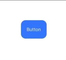
Awesome!
You can now drag-and-drop custom controls into your Storyboard and .xib interface files.
You can create more complex interfaces or widgets using this same process, to design any control that Apple doesn't provide.
Try It!
Following a tutorial will only get you so far.
Now that you know the steps:
- Create the round bounds again from scratch (do it again!)
- Create a UI element for your app idea
Custom Border Width and Colors
Wayne shared his code to customize the border width and color. Check it out:
@IBInspectable var borderWidth: CGFloat = 2 {
    didSet {
        refreshBorder(_borderWidth: borderWidth)
    }
}

func refreshBorder(_borderWidth: CGFloat) {
    layer.borderWidth = _borderWidth
}

@IBInspectable var customBorderColor: UIColor = UIColor.init (red: 0, green: 122/255, blue: 255/255, alpha: 1){
    didSet {
        refreshBorderColor(_colorBorder: customBorderColor)
    }
}

func refreshBorderColor(_colorBorder: UIColor) {
    layer.borderColor = _colorBorder.cgColor
}

func sharedInit() {
    refreshCR(_value: cornerRadius)
    refreshColor(_color: customBGColor)
    refreshBorderColor(_colorBorder: customBorderColor)
    refreshBorder(_borderWidth: borderWidth)
    self.tintColor = UIColor.white
}
In the process of creating an @IBDesignable element you will learn how to debug problems and deal with issues. You'll learn way more by doing, instead of following a tutorial word for word.
-
Let us know what you create, email Paul at Paul@SuperEasyApps.com with the subject "[IBDesignable] Round Buttons Idea
". -
Start the free 4-part course and make your first iPhone app: SuperEasyApps.com.
Download the 11 Step @IBDesignable PDF
Get the source code and the 11-step guide for creating @IBDesignable UI elements for iPhone apps.
You can reference this guide quickly when you make your UI more design friendly, so that you can iterate faster.