How to Make Menu Buttons Easy to Tap in UIKit and SwiftUI

Previously in UIKit it felt like default UIButton's worked great out of the box. If you used system buttons they came with opacity animations when you tapped on them. It didn't require extra work to configure the touch interaction or size.
It is not as easy in SwiftUI to have great touch experiences. You can create tiny, hard to tap Button's without realizing it. I see a lot of developers using TapGesture instead of the Button, which loses out on the accessibility features that Button provides.
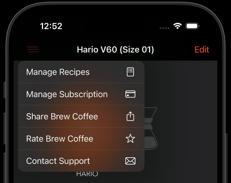
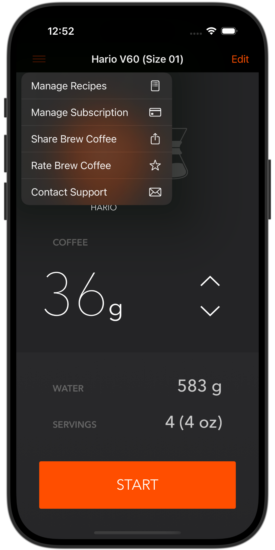
Recently, I was having a difficult time tapping on a SF Symbol based button in my Brew Coffee app. If I used a normal UIBarButtonItem it worked fine, but when I configured a UIMenu it failed to tap easily. I had a lot more miss-taps unless I was directly on top of the tiny 24x24 icon.

You can solve this problem, but it requires more code to make it feel right. I've submitted #FB15347053 to Apple (Menu Button as UIBarButtonItem or Menu in SwiftUI Are Hard to Tap).
Here are my workarounds for both UIKit and SwiftUI:
UIKit Solution: UIMenu and UIBarButtonItem are Hard to Tap
To get the effect in UIKit, you need to wrap a UIButton in a UIBarButtonItem. It feels like more work than it should be to make a tab bar button easy to tap.
So far in my testing, the backgroundColor is required for the tap region to work across the background of a Menu based button. The collision detection logic seems different from standard UIButton's tap behavior.
I don't love setting the color, hopefully UIColor.systemBackground doesn't clash with your menu bar color. An alternative may be to create a custom UIButton subclass that implemented the hitTest() method to include transparent regions.
let menuButton = UIBarButtonItem(title: "Menu", image: UIImage(systemName: "line.3.horizontal"), primaryAction: nil, menu: menu)
self.navigationItem.leftBarButtonItem = menuButton

// Create a UIButton
let button = UIButton(type: .system)
button.setImage(UIImage(systemName: "line.3.horizontal"), for: .normal)

// Adjust button size
button.frame = CGRect(x: 0, y: 0, width: 44, height: 44) // Customize size as needed
button.backgroundColor = UIColor.systemBackground // Must set a color to get button size to be respected
//        button.backgroundColor = .blue // Must set a color to get button size to be respected

// Alternatively you could increase size with Auto Layout
//        button.translatesAutoresizingMaskIntoConstraints = false
//        button.addConstraints([
//            button.widthAnchor.constraint(equalToConstant: 44),
//            button.heightAnchor.constraint(equalToConstant: 44)
//        ])

// Setup the menu
let menu = UIMenu(title: "", children: [
    UIAction(title: "Action 1", image: UIImage(systemName: "star"), handler: { _ in
        print("Action 1 tapped")
    }),
    UIAction(title: "Action 2", image: UIImage(systemName: "heart"), handler: { _ in
        print("Action 2 tapped")
    })
])

// Assign the menu to the button
button.menu = menu
button.showsMenuAsPrimaryAction = true

// Wrap the UIButton in a UIBarButtonItem
let barButtonItem = UIBarButtonItem(customView: button)
self.navigationItem.leftBarButtonItem = barButtonItem
Now your button tap region should match the size you set for the width and height.
SwiftUI Problem: Menu Button Text is Hard to Tap
In SwiftUI you should avoid the Menu(_:content:) APIs that will make the tap area very small with text. It will not have any horizontal or vertical padding, thus making it very hard to tap.
Menu("Options") {
    Button("Order Now", action: placeOrder)

    Button("Adjust Order", action: adjustOrder)
    Button("Cancel", action: cancelOrder)

}
.padding() // No effect on the tap size, must use alternate API
.contentShape(Rectangle())
.background(Color.red)
Transparent regions in SwiftUI are not tappable by default, so you need to make sure to set either the clipShape() or contentShape() to make buttons tap across the entire surface.
SwiftUI Solution: Custom Menu Buttons
You should use the Menu(content:label:) API because that allows you to provide a customized label with padding.
Menu {
    Button("Order Now", action: placeOrder)
    Button("Adjust Order", action: adjustOrder)
    Button("Cancel", action: cancelOrder)
} label: {
    Image(systemName: "ellipsis.circle") // Customize the size
        .resizable()
        .frame(width: 24, height: 24)
        .padding(16)
        .background(Color.clear)
        .contentShape(Rectangle()) // Makes entire region tappable
}
Now you will have easy to tap buttons. You can make your buttons 50+ points wide to make them easier to tap, but that can extend the button size that may displace adjacent buttons (if you support multiple buttons in a row).
What is Causing the Tap Issues in SwiftUI?
To me, the SwiftUI tap behavior on transparent pixels has been a regression in usability because it's easy to create UI elements that are not easy to touch with real fingers. If you only test with a mouse in the iOS Simulator, you will not catch these real world issues.
Without this attention to detail for SwiftUI buttons your users will need to tap a button multiple times to get the expected behavior.
Please share this article if you learned how to handle Menu buttons on iOS.
Let me know if you discover a better way to make Menu buttons on iOS: @PaulSolt on X.
