Idea to macOS App - User Onboarding Iterations Exposed

7% of users will leave your app in 3 seconds.
45% of users will leave within 30 seconds.
Do your customers understand your app?
In my own apps I've used Flurry Analytics (now owned by Yahoo) to get insights into how long customers use my app.
AND I learn what features they find . . . because most don't use anything except the most obvious features.
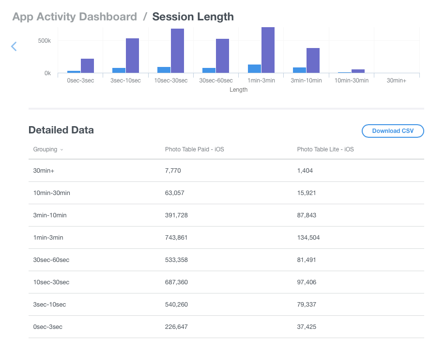
You can see how long people use my Photo Table app.
My drop-off is pretty dramatic, considering that I haven't updated it for iOS 11 because I haven't had time (I'm literally losing thousands of customers).
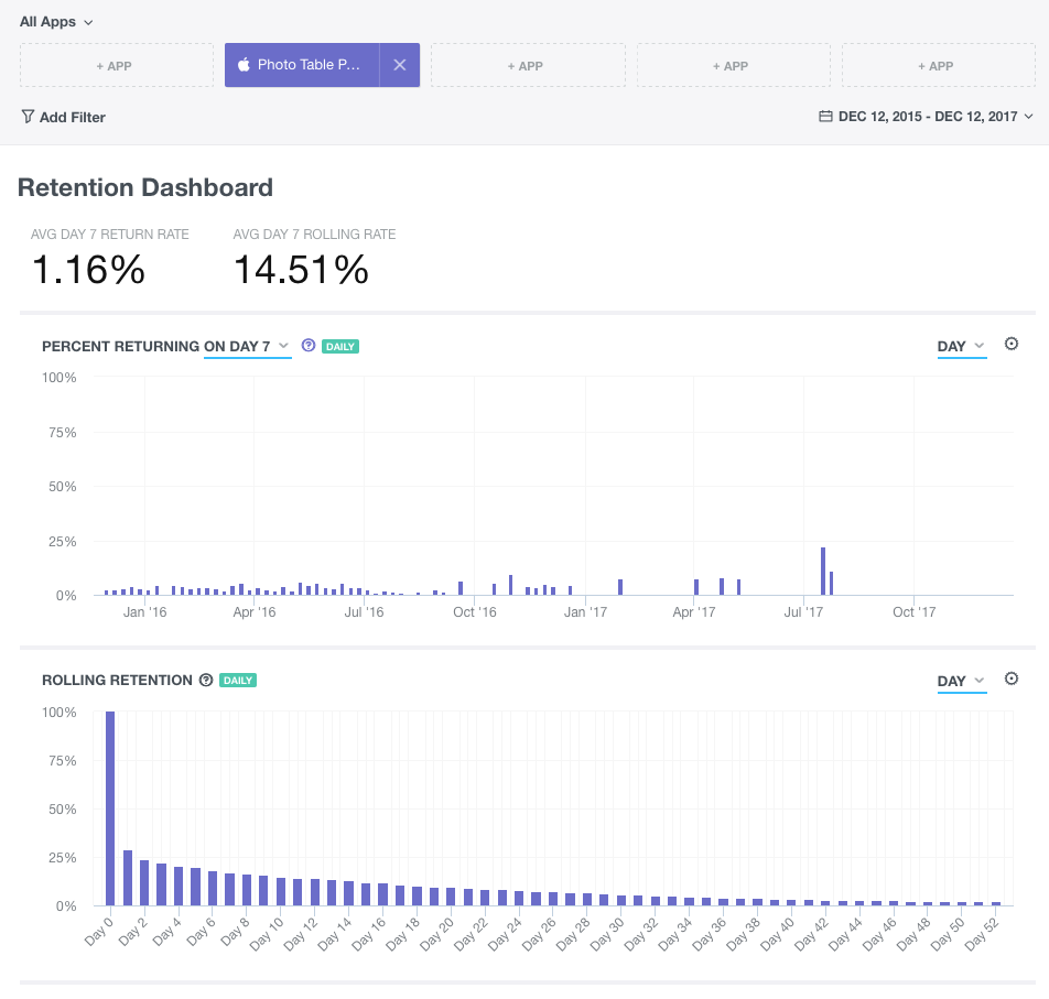
Analytics are incredibly insightful and the data will change the way you look at your app.
Shipping your first product on any App Store is a major accomplishment, and a tremendous learning experience.
One of the core features that I put my foot down on was the new user onboarding process.
I know my own app statistics and I believe that video (without audio . . . really important!) is the best way to capture someone's attention and show them your app.
Silent Video Onboarding
Story time!
Too often I run into an app that all of sudden surprises me with video and loud music/voiceovers.
I purposely never opened a major app from Facebook (Paper) because of this noise issue.
Every time I tried to start the Facebook Paper app, it would YELL at me, and every time that happened I was in an awkward environment (completely silent setting, yet surrounded by tons people).
Don't create an experience that makes your users feel awkward in public!
Craft the Initial Experience
You want to craft the initial experience so that it's positive, make sure you have users test it before you ship it!
Watching someone use your app is the best way to know if it makes sense. Take notes, record the session with permission, and observe.
From Concepts to Implementation
I love pen and paper (Staedtler pigment liner's 0.3mm and Moleskine notebooks).
BUT . . .
When I'm starting a brand new idea, or I'm not fully committed I like paper that is loose.
That's when I grab sheets of 14"x8.5" printer paper.
Sometimes I need to see everything to SEE the big picture and loose paper is fantastic for spreading out on a large desk.
For me storyboarding is very iterative (I am by no means an expert).
I might start an idea on a piece of loose leaf or a napkin, and then flesh it out in more detail on a full page.
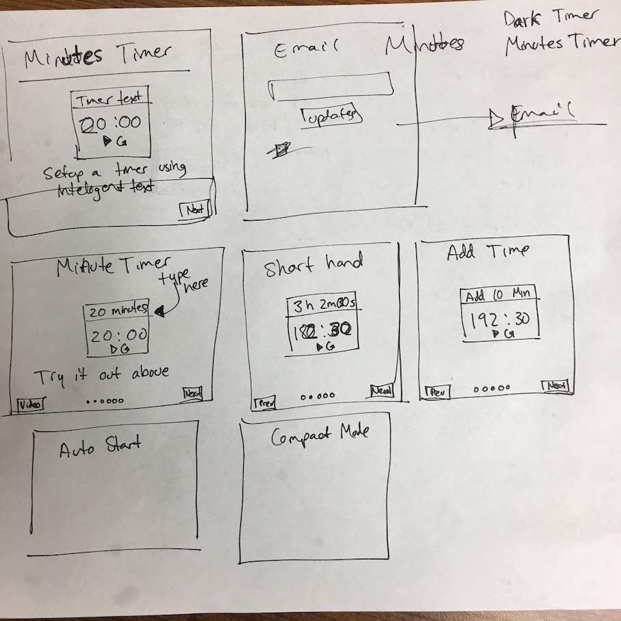
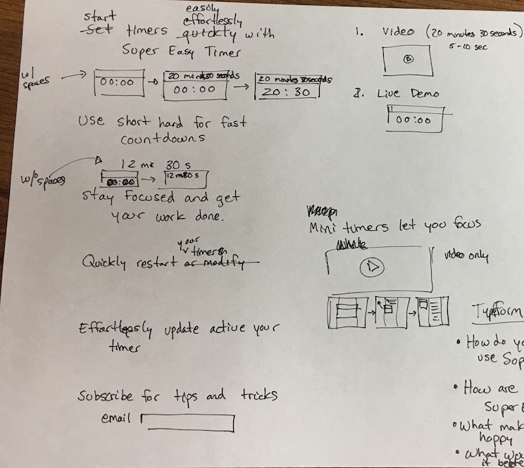
In October 2017 this was my initial sketch for my vision for the onboarding process in our "Super Easy Timer" app.
The goal was to show the user some of the features.
I really, really, really wanted to do an interactive tutorial.
So that's where we started . . .
To get an interactive timer we had to approach the UI design differently. The timer view needed to be able to inserted into other windows.
We also wanted to show videos and built a quick prototype using Storyboard and tabbed pages.
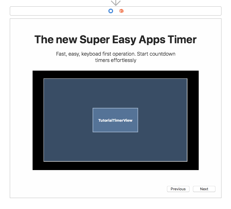
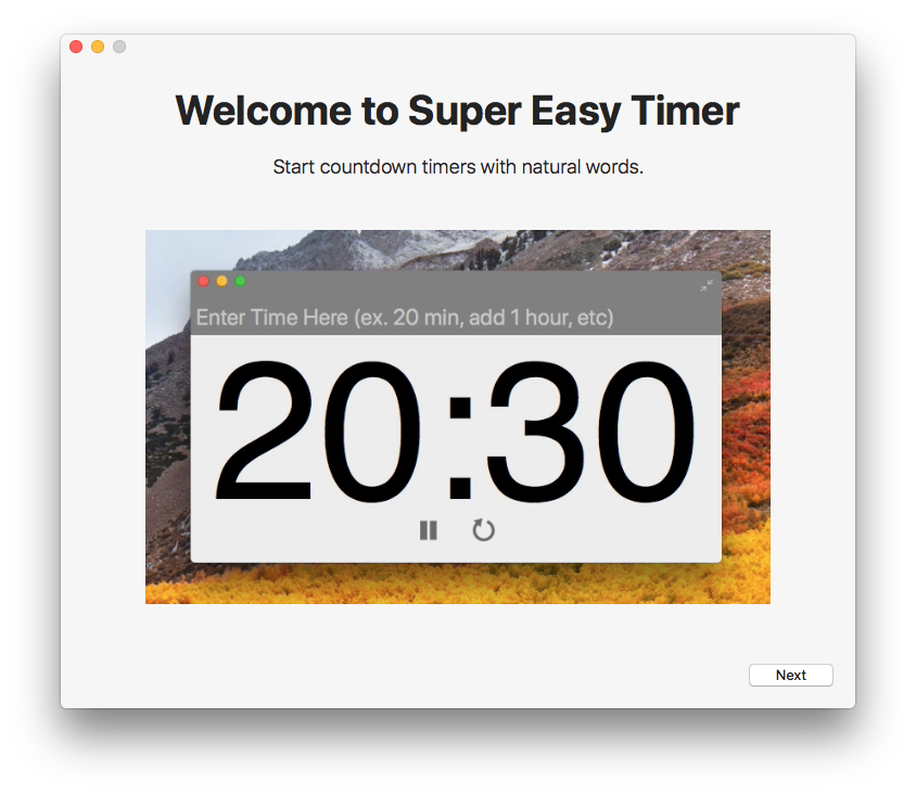
Each tab in our Tutorial window can have different content with a headline, subhead, and an some kind of multimedia content (image, embedded timer view, or a video).
Using tabs was a fast way to mock up the experience and make it easy for programmers to edit.
Future Proofing with JSON
Ideally I'd like to switch over to JSON based content, but that requires defining the types of content, and any special popover content items or animations (i.e.: dynamic callout arrows on top of tutorial screens).
The JSON format would be more design friendly, but it requires WAY more engineering.
There's more to the story than building the "best" onboarding feature. We need to ship something, and the real important part is content.
Our content needs to tell our story as quickly and concisely as possible.
Creating the User Onboarding Content
I sat down for 2 hours to review the current state of UX and UI from existing apps.
After getting some inspiration I took two paths.
First I Started to List Out the Content That Should Be Displayed
- Heading copy (the benefit/feature to demonstrate)
- Subhead copy (the details)
- Storyboards for videos (the flow)
Second I Mocked Up a Checklist
While I was looking at examples I came across a few web apps that were doing a checklist (which seemed like a good use of gamification and open loops).
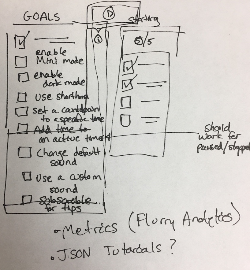
People like to cross things off, but this can back fire if your users struggle!
I know from my experience, there's one app I'm using that wants me to enable Notifications. It won't let me check off the final item until I do, and I won't.
I don't want to be interrupted.
The checklist onboarding is neat because it would allow us to move the interactive tutorial outside of our initial user onboarding screens.
We can incentivize our users to try some of the other ways to create timers using a checklist.
It also means that my initial idea for an interactive embedded "timer" in the tutorial onboarding might have been a bad idea.
AND we spent a good deal of time working on that feature . . . thankfully we are using it to implement our mini-mode and large-mode feature, so it works out if we cut interative timers from the tutorial.
Improving the checklist
We could craft a nice little window with checkmarks for tasks completed, and even provide content for how to do a task with an embedded video/description. See the sketch above for my quick mockup.
Storyboarding the Tutorial Screens
It became clear that I needed to capture a whole lot more details for what content we would show in the tutorial screens.
Here's what my next iteration of storyboard screens started to look like:
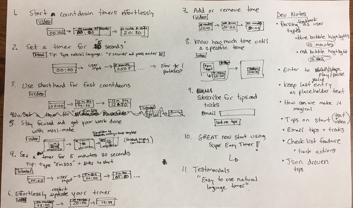
Going through this iteration phase was essential for starting to figure out all the pieces we would either need to build, or the modes we might want to support (development time).
Again, this was very rough, but it was enough to pass off to Luke (my intern) to code up the initial experience for our beta testers.
The Importance of Storyboarding
I took for granted the power of storyboards for videos. Especially when I don't create the videos . . .
Luke quickly threw together some videos, but it was clear from my initial storyboards that you need to capture the timing and the feel.
It's hard to hand off a storyboard to someone else and have them implement it. Especially when you want them to capture your vision.
The more details you can capture in your storyboards the more likely someone else is going to be able to understand what you want to convey.
Watch the Super Easy Timer Onboarding Experience
Let's dive into what the onboarding feels like:
Watching our video you can see how the embedded videos create a fun experience.
We might scrap the inline interative timer in a future beta, but to keep things simple, we're going to ship our beta test as is.
No new features, just copy and video tweaking for this beta test.
What App Are You Making?
Do you need to onboard users for your app?
Share a sketch of what you're planning to do for when someone first opens your app.
I'd love to see what you're working on. If you have questions, email Paul@SuperEasyApps.com with the title "[Super Easy Timer] User Onboarding"
PS If you want to join our beta test for Super Easy Timer click on this link. Fill out a quick survey and then you'll get the beta when we send our our next batch!
Anyone who joins the beta is going to get an inside look into app development including pricing, launching, and insight from the iterative flow of a beta test.
