Opinionated apps designed for humans

I'm going to take you on a software publishing journey that's happening at Super Easy Apps.
My goal is to give you an inside look into the entire process of making apps people love, and how to design all the bits and pieces that go into the process.
Keep reading to learn about the philosophy behind making crash free apps that are easy to use. Software that has a fixed design for a specific user.
major
Another timer app ?!

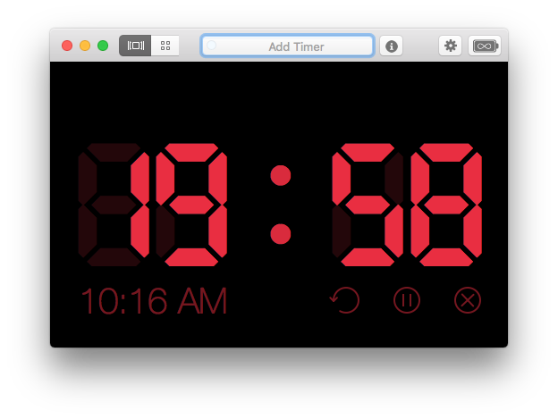
The tentative name of our upcoming app is "Super Easy Timer", but that's going to be subject to change with your feedback.
I built this app because I wasn't satisfied with the status quo.
When you use an app for the first you expect it to behave a specific way, and when there's a disconnect, even if it's just 100 milliseconds you notice the difference.
Your subconscious is very in-tune with how the world works, and in the physical world objects behave in predictable patterns.
The same is true with apps, even if you can't express how you feel on the conscious level, you can instantly form an opinion about an app based on how it looks.
- "Mom, you have to download this app!"
- "That app feels cheap"
- "I hate this app!"
As an app developer it's hard to know what works without trying it.
Paper prototypes are a good start, but nothing compares to a simple prototype that demonstrates the core feature.
That's the beauty of app development.
Your challenge is going from "tech" demo to fully functioning app . . . and getting that app into the hands of people who care.
Crash free, ease to use, and opinionated design are all important . . . let's dive into what these three things mean to apps.
Crash Free
Too many apps are unstable.
You open them and they crash immediately. You click a button and nothing happens, you tap on a row, or scroll too far and it stops.
The app becomes unresponsive and you need to force quit the app, or worse, restart your iPhone.
**Confusion and the Stupid User Problem
**
There's no feedback, it's all rather confusing, and it makes you feel dumb.
"Am I stupid" is a very common phrase I hear when I'm walking a new user through a piece of software . . .
The answer is no.
. . . software is stupid if it doesn't make sense for the user, if it's not clear, and if common actions are not easy to pick up.
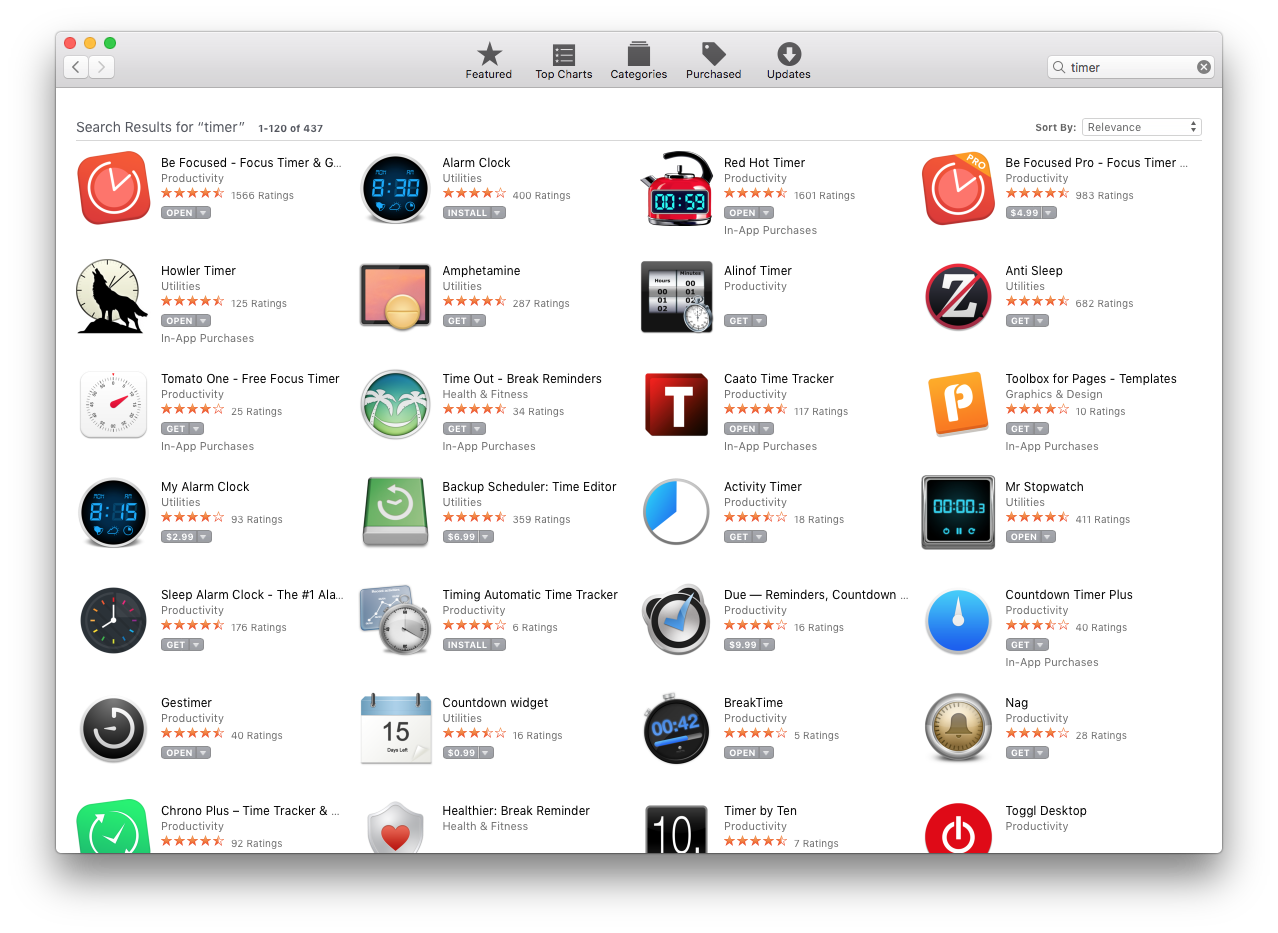
In my search for a timer app, after reading David Allen's book "Getting Things Done", lead me to apps that sometimes work, but many times fail.
Red Hot Timer

There were aspects of the Red Hot Timer that I really enjoyed, but when High Sierra was released the app wouldn't last the full 20 minutes . . .
. . . or it would hang and become unresponsive
. . . or it would stop counting down
If you had one job and it was to count, you'd better be good at it.
That's how apps are, and I have very little leeway for buggy software.
Productivity apps need to maintain a high standard. Not only to software development best practices, but also ease of use.
Note: Red Hot Timer has a phenomenal user on-boarding walkthrough if you want a case study of how an app should be experienced the first time you open it (as always there is room for improvement).
Ease of Use
Many apps are not easy to use because the developer isn't used to having real people use their apps.
Most developers build their apps in isolation and never get outside input. They never put their app to the test in a public setting.
I've done numerous festivals with each of my apps, and what I've learned is that what you as the developer think is easy to use, doesn't always map to other people's expectations.
Before you demo your next app . . .
. . . before you release your next update
. . . before you submit your app to the App Store
. . . you need to make sure you test your app with real people.
User testing can uncover 80% of the issues with just 5-6 people who have never seen your app.
I always record the session (with permission), so that I can look back on the tests for anything that I may have missed in my notes (I'm scribbling notes and ideas as quickly as I can during a live user test).
Just having the feature checklist doesn't make your app good. That's where you need to have an opinion of how things work.
Opinionated Design
As a developer your goal should be to build software that does something better, that connects dots that have been left unconnected, and that provides an ideal workflow to a common problem.
The way in which our upcoming timer app works is very much opinionated based on my experience with existing timer apps on the App Store.
It's opininated in how the features work, and the way in which the features behave.
As developers and designers we can't leave every option up to the user.
That's not good design.
Your app needs to be intentional and it needs to guide the user on how to use it, without them having to read a 10 page manual.
Design should walk people through in a natural way.
If you don't stick your flag in the ground and say this is how we're giong to do it, then you're open to all kinds of feature and scope creep.
Version 1 is always the hardest, but it's all about putting your flag in the ground as a product designer and saying this is our app, this is what it does, and this is what it doesn't do.
Super Easy Timer (Beta)
If you struggle with managing your time, or you need more accountability in your own line of work then you're a good fit for our new app.
Our timer uses natural language to create timers that can be quickly started and stopped.
One of the hardest parts about anything is just starting.
The way I use this timer in the morning is to force myself to write (journal) for 5 minutes.
I set the timer by typing "5 minutes" + Enter.
Then I start writing, and I ignore anything that isn't writing.
The timer gives me focus and I believe that it can also give you focus.
That means no email, no text messages, no Facebook.
For 5 minutes I write.
Signup to beta test our app, Super Easy Timer, with this link.
I also use this when I need to send an email and I want to time box the task, it gives me a goal to try and finish by.
I used a 20 minute timer to draft this post, and four 10 minute timers to edit, and then post on Ghost (our blog platform).
