The Power of Beta Tests and Usability Tests

Creating software is a journey and today I'd like to talk about the importance of beta testing (and usability testing).
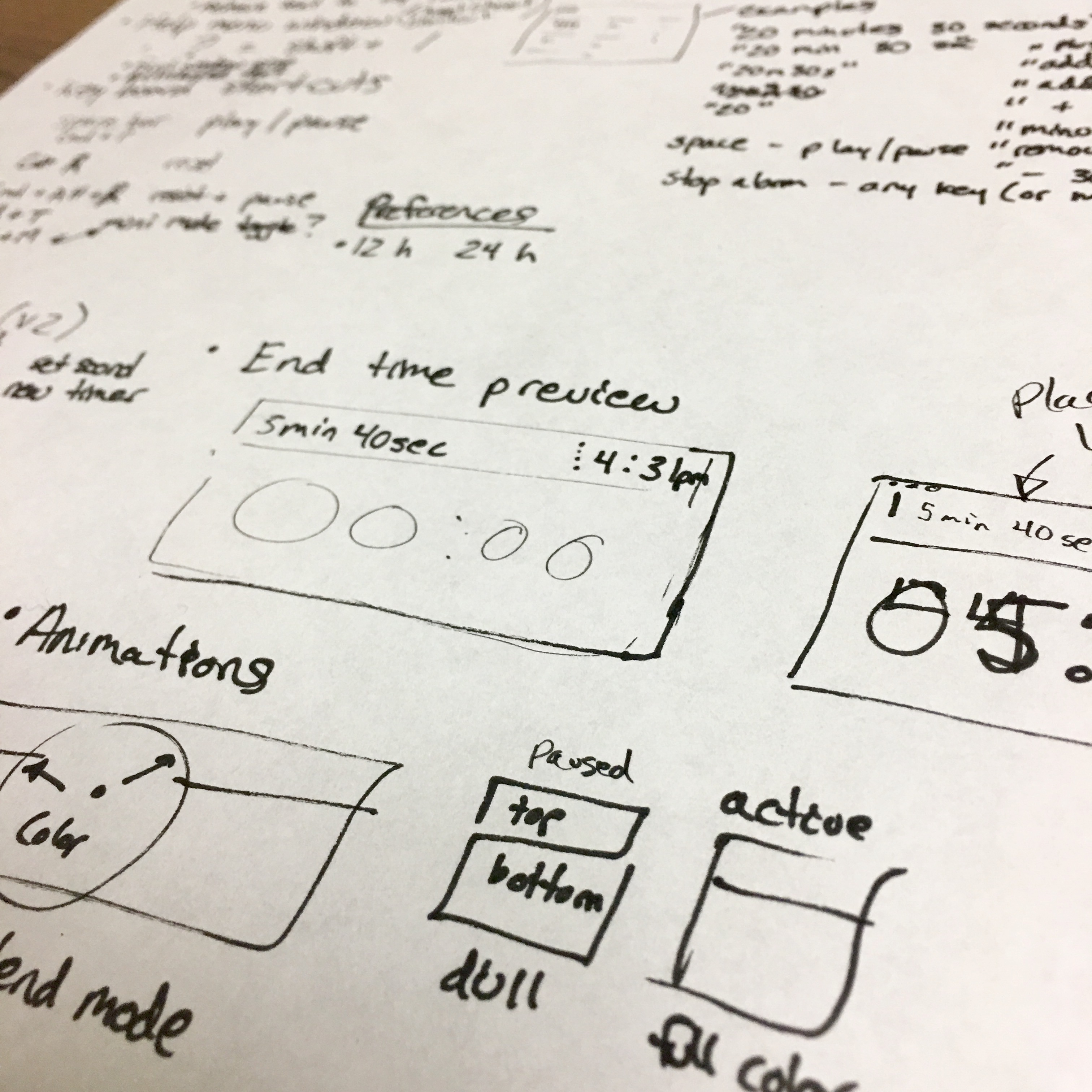
Over the past three months we've been working on the next version of our timer app.
It's very basic.
So simple that people beta testing it said:
"it's like super simple."
Yet even as a simple app there's a lot more too it (2,000+ lines of Swift 4 code), and as it turns out, there's a lot more work to crafting quality software.
To be honest, I thought that we'd be further along . . . but between teaching an iPhone app course at RIT, publishing a new Auto Layout course, planning a wedding, practicing TDD, and on-boarding a new intern I seem to run out of hours in the day.
Thankfully our beta test has given direction and clarity into what we need to focus on.
Software Estimation is Super Hard
Just when you think everything is ready to go, you find that pesky bug.
So you tell yourself: "That should be an easy fix."
Hours later, maybe even days later you discover that there's something much bigger lurking below the surface.
And what you discover is that pesky bug isn't simple . . . nor is it quick to fix . . .
It could be that you don't know enough of the API to find the right solution.
. . . so you scour the web for answers . . .
Jumping from Stack Overflow question to answer (repeat), looking for a solution to a problem you don't fully understand . . . yet (or so you hope!).
Details
Creating new software is hard because there's a lot of details below the surface of a simple problem. Much like icebergs are way bigger than what you see on the surface.
Even when you think the bug is cornered, and you're just about to have an elegant solution you might uncover another problem (performance or rendering).
As a programmer your job is to solve problems most people didn't even know exist. Simple apps are never quite simple, even something as simple as a single timer app.
Initial Beta Test
There has been a lot of refinement, and it wouldn't have been possible without our first beta test v1 version along with an in-person usability test.
We knew the app was rough around the edges, but it was fully functional and we needed feedback to know if other people would like it.
And we wanted to uncover any nagging usability issues.
Thankfully a few beta testers took us up on our offer, and some recorded videos using Loom, or sent emails with their initial experiences.
One of our testers even wrote a very lengthy "tweet storm" about all the features, issues, or things that could be done to improve the user experience.
User Testing
We discovered a lot of the usability issues in our initial in-person user test, which if you're not doing, I highly, highly recommend starting today.
Just give your app to someone else to use and give them a task.
Don't explain, just watch, smile nicely when they don't get it . . . and wait to answer questions as they try to figure it out.
Those long pauses are going to show you a lot, because you're watching someone learn how to use your app.
Based on what you see you might decide that one feature needs to be axed, or you might need to extend a feature to work differently.
In our tests, we uncovered there were holes in our grammar (the words that the text parsing understands).
Natural Language Parsing
People tried to create timers a specific way, but it didn't respond like they expected, worse yet it didn't do what they thought it would do, leaving them perplexed.
From our beta testing and in-person user testing we've fixed numerous bugs, worked around situations that were confusing to users, and opened bugs for fixes or future features.
We're a lot closer to a final product, but the end still feels a bit away, since the number of remaining features continues to grow.
Feature Creep

Now is the time were we need to lock in the priorities for the initial version, and lock out anything that doesn't contribute to an earlier release date.
The on-boarding experience is my primary focus along with our design, animation, and monetization strategy (which seems to keep going between a paid app, free app, trial app, or a freemium app with in-app purchases).
Even if the release date is bumped back, I really do love this new app. It's helped me be more productive, and even enabled my twin sister to finish her latest course work in a fraction of the time she thought she needed.
There's something good about focusing with a deadline that will make you write, edit, and publish content faster!
I Love my new timer macOS app
I use this new app on a daily basis.
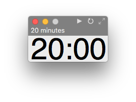
It's the fastest way to create a timer using natural language, and it's very easy to reset or modify the duration.
I set a 20 minute timer just by typing "20 minutes".
Then I write for 20 minutes.
No editing.
Just write a stream of consciousness, trying to get anything that's in my head on paper, so that I can make progress instead of looking for that perfect word.
This post was written during my editing phase of my first draft, and apparently there was a lot more that I wanted to share. And now that's finished I can share it with you too!
I hope that you find this article helpful, and if you're interested in timing your own writing (or coding), signup for the Super Easy Timer beta test.
We're using Github, GitFlow, and manuscript to track our progress . . . all of which has been extremely helpful for a small team. Comment below if you'd like to hear more about our process.

